10 Living Room Color Schemes to Try This Year (Beyond Grey & Beige)
Your living room deserves more than “landlord greige” and the same sofa everyone saw on page 3 of the catalog, right?
I went through that phase where I painted everything grey, bought one sad beige rug, and wondered why my space felt like a waiting room. Once I started playing with real color schemes, my living room finally looked intentional instead of “temporary chaos with throw pillows.”
If you feel bored with grey and beige, but bold color scares you a little, stay with me. I’ll walk you through 10 living room color schemes that feel stylish, livable, and not like a circus tent.
Ready to upgrade from “it’s fine” to “ok wow, who are you?”
1. Deep Navy & Caramel: Cozy, Not Cave-Like
Navy scares a lot of people, but it actually acts like a better black in a living room. It adds drama without killing the vibe.
Pair deep navy walls with caramel leather and warm woods, and you create a space that feels like a smart, cozy library instead of a dark dungeon.
How this living room color scheme works
- Navy gives the room a strong backdrop and makes art and greenery pop.
- Caramel leather (sofa or chairs) adds warmth and keeps the room from feeling cold.
- Warm white trim and soft cream textiles balance the depth.
Style it with
- A navy accent wall or all four walls if you feel brave.
- Caramel or tan leather sofa, plus off‑white or oatmeal cushions.
- Brass or antique gold lamps and frames.
- A textured cream rug to lighten the floor.
Ever notice how navy instantly makes everything look more expensive? That’s why I keep going back to it IMO.
2. Forest Green, Cream & Black: Modern but Earthy
If you want a grown‑up living room that still feels relaxed, forest green + cream + black checks all the boxes.
I used this combo in a rental with ugly floors, and the green totally distracted everyone from the questionable laminate. Magic.
Why this scheme feels so good
- Forest green brings that “indoor forest” energy without screaming “look at me.”
- Cream softens the palette and keeps the room bright.
- Black accents sharpen the look and stop it from feeling too rustic.
Style it with
- Forest or olive green on one main wall or lower half of the walls.
- Cream or off‑white sofa and curtains.
- Black metal coffee table or side tables.
- Natural elements: plants, woven baskets, jute or wool rug.
You love nature but don’t want a “cabin” theme? This color scheme hits that sweet spot.
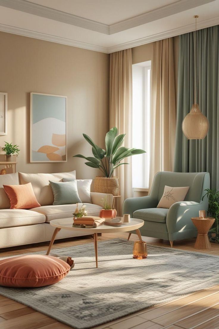
3. Terracotta & Blush Neutrals: Warm, Soft, and Not Too “Pink”
Want warmth without beige overload? Try terracotta with blush and soft neutrals.
Think Mediterranean vacation instead of dusty 90s peach. Big difference.
Why this living room color scheme works
- Terracotta adds earthy warmth and depth.
- Blush or nude tones bring softness without turning the room into a bubblegum ad.
- Warm white stops the palette from feeling heavy.
Style it with
- Terracotta accent wall or large artwork with terracotta tones.
- Blush or nude cushions on a warm white or oatmeal sofa.
- Light oak or rattan furniture to keep the room airy.
- Black or dark bronze details for contrast (picture frames, lamp bases).
FYI, this combo flatters literally every skin tone in photos, so your living room selfies win too. 🙂
4. Charcoal, Rust & Mustard: Bold But Very Livable
You want color, but you also want to keep things sophisticated. Charcoal, rust, and mustard create a strong, mid‑century leaning palette that still feels cozy.
I used this combo once in a small space, and everyone assumed I hired a designer. I didn’t. I just hoarded paint swatches for weeks.
Why this palette stands out
- Charcoal grounds the room more gently than pure black.
- Rust adds warmth and feels more grown‑up than bright red or orange.
- Mustard brings a subtle hit of sunshine.
Style it with
- Charcoal sofa or accent wall.
- Rust velvet cushions, throw, or accent chair.
- Mustard in small hits: a pillow, artwork, or lamp shade.
- Warm wood or walnut furniture to echo the richness.
Ask yourself: do you want your living room to feel like a furniture showroom or like a cool boutique hotel lobby? This combo leans hard into the second option.
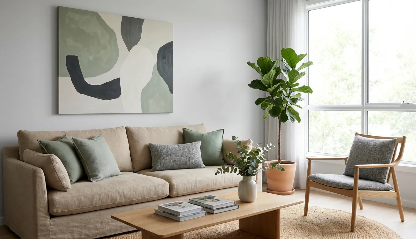
5. Soft Sage, Warm White & Light Wood: Calm Without Boredom
If you want a calming space but feel tired of grey, soft sage green steps in as the hero.
This scheme works especially well if your living room doesn’t get a ton of light, because sage still looks fresh in low light.
Why this living room color scheme stays timeless
- Sage green reads soft and neutral but still counts as real color.
- Warm white keeps everything light and airy.
- Light wood adds a natural, Scandinavian touch.
Style it with
- Sage walls or a sage media unit / bookcase.
- Warm white sofa, or white slipcovers if you prefer flexibility.
- Light oak coffee table, sideboard, or picture frames.
- Layered textures: linen, cotton, wool, woven baskets.
Ever walked into a room and instantly felt your shoulders relax? This palette creates that feeling on purpose.
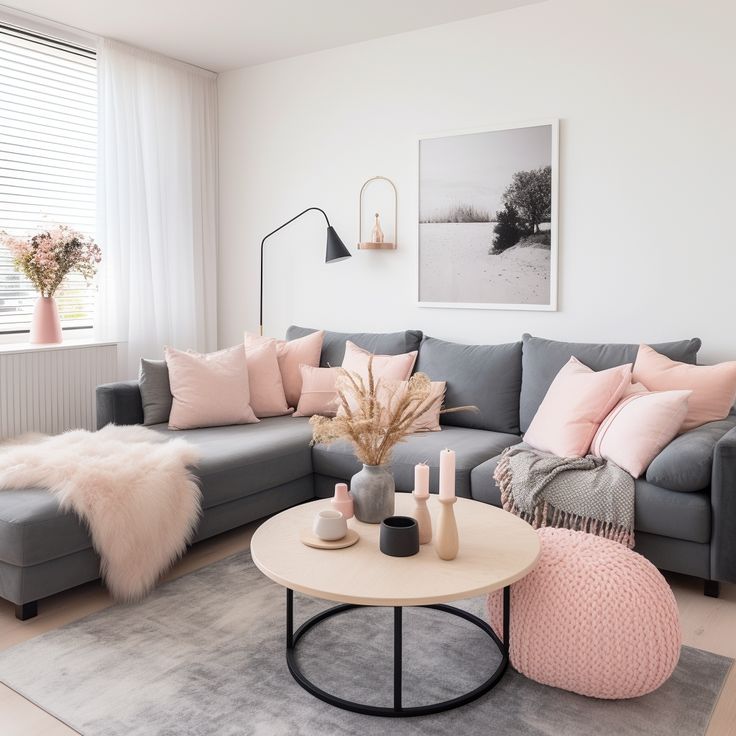
6. Ink Blue & Soft Pink: Elegant, Not “Nursery”
Blue and pink together sound risky, but ink blue with muted, dusty pink feels surprisingly sophisticated.
Think art gallery meets cocktail lounge, not baby shower.
Why this combo works so well
- Ink or midnight blue adds drama and depth.
- Soft, dusty pink keeps things warm and romantic.
- Warm metallics like brass or brushed gold tie everything together.
Style it with
- Ink blue walls or a deep blue sofa.
- Soft pink cushions, throw, or a single armchair.
- Marble or glass coffee table with brass frame.
- Neutral rug in cream or subtle pattern to ground the space.
If you love a slightly glam living room color scheme but still prefer comfort over sparkle, this one hits the mark.
7. Black, White & Natural Wood: High Contrast, Zero Sterility
You might see black and white and think “monochrome Instagram set,” but black, white, and natural wood create a warm, modern living room when you balance them right.
I lean on this palette when I want a long‑term, low‑regret choice.
Why this color scheme feels fresh
- White walls keep everything bright and flexible.
- Black adds sharp contrast and structure.
- Natural wood stops the combo from feeling cold or clinical.
Style it with
- White walls, black window frames (if you can change them) or black curtain rods.
- Natural oak TV unit, coffee table, or open shelves.
- Black and white pillows, art, and lighting.
- A textured rug (jute, wool, or a subtle pattern) for warmth.
This scheme works especially well for open‑plan spaces, because you can extend the palette easily into the dining or kitchen area without chaos.
8. Aubergine, Taupe & Brass: Moody and Luxe
If you feel curious about moody colors but don’t want pure black walls, aubergine (deep eggplant) offers a rich, luxurious option.
Pair it with taupe and brass, and your living room starts to feel like that dim, fancy bar where the cocktails cost too much—but in a good way.
Why this living room palette feels luxurious
- Aubergine adds depth and a subtle hit of color.
- Taupe softens the scheme and bridges dark and light elements.
- Brass highlights the richness and adds glam without glitter.
Style it with
- Aubergine accent wall behind the sofa.
- Taupe sofa or armchairs, plus soft neutral curtains.
- Brass floor lamp, side table, or mirror frame.
- Dark wood or black furniture for structure.
Ever wanted a grown‑up, dramatic living room you can still binge Netflix in? This combo delivers exactly that.
9. Teal, Sand & Brass: Coastal, But Make It Chic
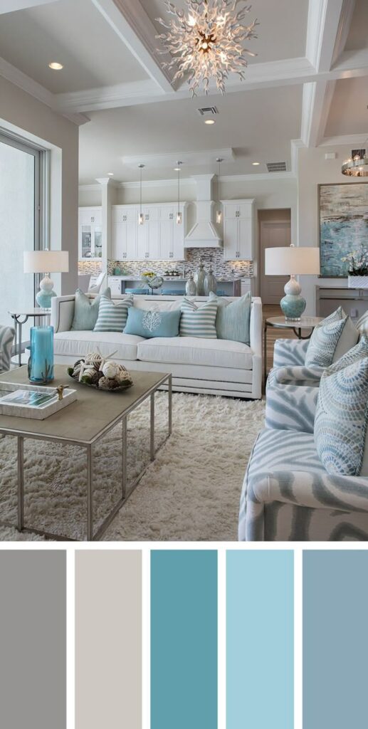
You don’t need seashell art and “Beach House” signs to get a coastal feel. Teal, sand, and brass create a polished, breezy living room color scheme.
Think cool ocean water with sunlit sand, not cheesy beach rental vibes.
Why this palette stays interesting
- Teal gives a hit of color that still feels natural and soothing.
- Sand tones keep the room soft and relaxed.
- Brass adds warmth so teal never feels too cold.
Style it with
- Teal on a feature wall, or a teal rug if you fear painting.
- Sand‑colored sofa and light linen curtains.
- Brass curtain rods, lamps, or picture frames.
- Artwork with watery blues, greens, and neutrals.
If you love blue but feel bored with navy, this scheme offers a fresher alternative.
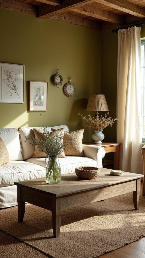
10. Warm White, Olive & Brick: Earthy and Layered
You like neutrals, but you want more personality than basic beige. Warm white, olive green, and brick tones give you an earthy, layered living room without huge risk.
I love this combo for older homes or apartments with character, because it respects the architecture instead of fighting it.
Why this living room color scheme feels grounded
- Warm white keeps the space light but cozy.
- Olive green adds calm, natural depth.
- Brick or terracotta tones bring warmth through textiles or actual brick.
Style it with
- Warm white walls as your base.
- Olive green accents: cushions, a painted cabinet, or an accent wall.
- Brick tones in a rug, throw, or exposed brick (if you have it).
- Add black or dark bronze hardware and lights for contrast.
This palette feels especially good if you already own some wood furniture and you want everything to finally look intentional.
How to Choose the Right Color Scheme for Your Living Room
You scrolled through all these options and now your brain feels like a paint chart? Totally normal.
Use a quick checklist so you avoid random impulse choices:
- Check your light first.
- North‑facing rooms handle warmer colors (terracotta, rust, mustard, brick) really well.
- South‑facing rooms can handle cooler tones (navy, teal, ink blue) without feeling icy.
- Look at what you already own.
- Keep your main sofa if it still works and build a new living room color scheme around it.
- Pull colors from a rug or artwork you love instead of starting from zero.
- Decide how bold you feel.
- Want low commitment? Use color in cushions, art, and throws.
- Feel brave? Paint one accent wall or a media unit first and live with it for a week.
- Limit your palette.
- Aim for 1–2 main colors + 2–3 neutrals.
- Too many colors = chaos. Too few = snooze. Balance wins.
Ever notice that the rooms you pin on Pinterest rarely use more than a handful of colors? Designers follow that rule for a reason.
Final Thoughts: Color Beats “Safe” Every Time
Grey and beige had a long, comfortable run. They kept everything neutral, and a lot of real estate agents felt very happy. But your living room can do better.
You can:
- Go dramatic with navy, charcoal, aubergine, or ink blue.
- Stay calm with sage, soft greens, and warm whites.
- Add warmth with terracotta, rust, mustard, and brick tones.
- Keep things sharp with black, white, and natural wood.
Pick one of these living room color schemes, test it with paint samples, and sit in the room at different times of day. Your eyes and your mood will tell you more than any trend list, IMO.