13 Paint Colors for Living Room Spaces With Lots of Natural Light
Your living room gets a ton of natural light, and you feel unstoppable… until you slap paint on the walls and the color turns into something you didn’t order. Been there. I once picked a “soft greige” that looked classy in the store and then screamed “purple beige surprise!” at noon in my sun-drenched living room.
Lots of sunlight makes a room feel bigger and happier, but it also exposes undertones, amplifies contrast, and basically tells on your paint choices. So let’s pick colors that actually like bright rooms, not shades that melt into glare or turn weird by 3 p.m. Sound good?
Before You Pick a Color: What Natural Light Actually Does
Natural light changes all day, and your paint color changes with it. Morning sun can feel cool and crisp, afternoon sun can feel warm and intense, and late-day light can go golden and dramatic. Ever noticed how the same wall looks calm at breakfast and chaotic at dinner?
When you choose paint colors for living room spaces with lots of natural light, you need to think beyond “pretty swatch.” I always test samples on two walls because the light shifts hard from angle to angle.
Here’s what I watch for in bright rooms:
- Undertones pop (pink, green, violet, yellow—yep, they show up)
- Light colors can wash out and look flat if they lack depth
- Dark colors look richer and less cave-like than you expect
- High-gloss finishes reflect like a mirror, so I usually stick to eggshell or matte
FYI, I take photos of samples at 9 a.m., 1 p.m., and 7 p.m. because my eyes lie to me after coffee.
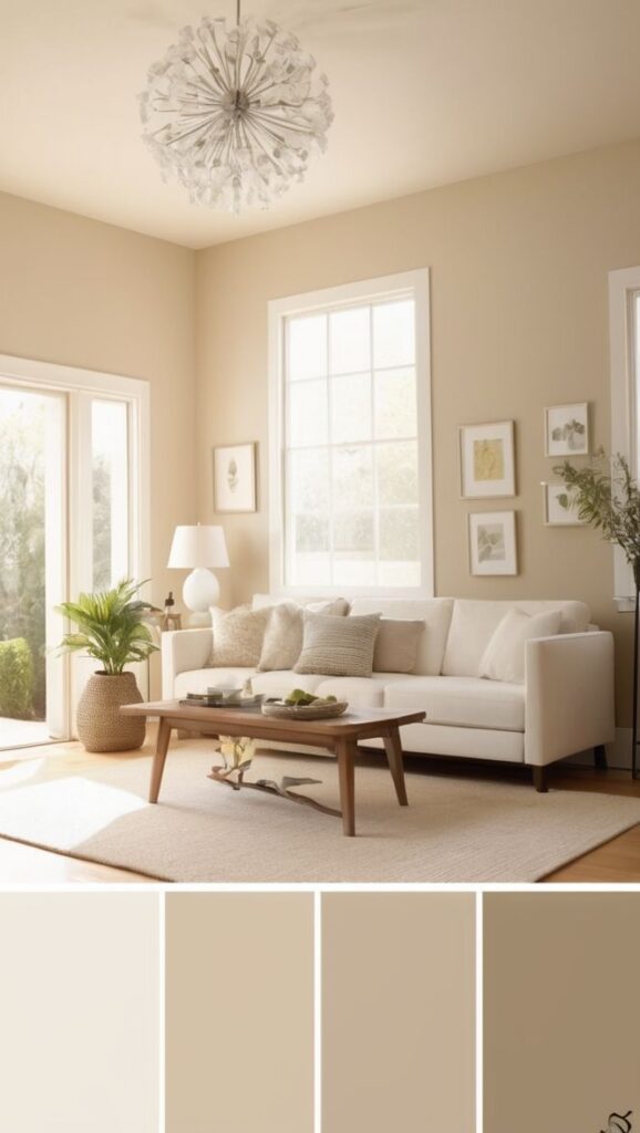
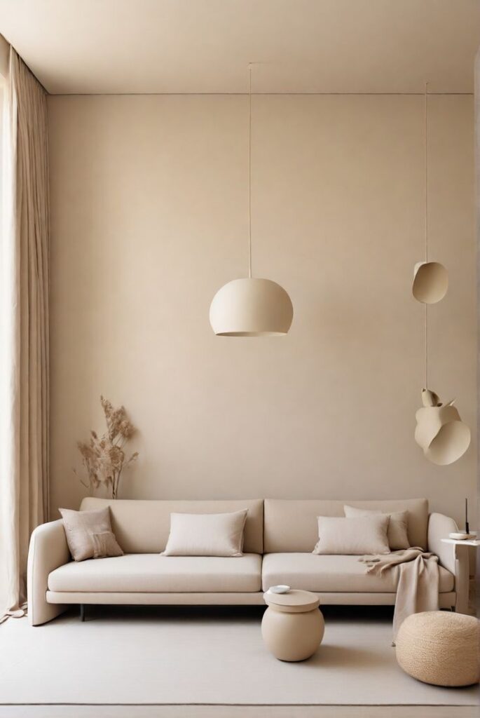
1) Warm White (Creamy, Not Yellow)
A warm white gives you that bright, clean look without turning your living room into a sterile photo studio. In strong natural light, I like a white that carries a soft creamy undertone so the walls still feel warm at peak brightness. Do you want airy and cozy? This shade plays both sides.
Try it if you want your furniture and art to do the talking.
- Best for: open layouts, lots of plants, warm wood floors
- Pairs well with: linen textures, brass, natural oak
- Avoid if: your sofa already leans yellow-beige (it can stack warmth fast)
2) Crisp Neutral White (Clean and Modern)
Crisp neutral white gives you that “freshly edited” look, especially in rooms with huge windows. Natural light makes this color feel sharp and intentional, not dingy. I love it when I want clean edges and modern contrast without going full gallery.
Do you decorate with black accents or bold art? This white makes them pop.
- Best for: modern, Scandinavian, minimal spaces
- Pairs well with: black frames, charcoal rugs, chrome
- Watch out for: super cool daylight, which can push it slightly icy
3) Soft Greige (The “I Can’t Commit” Hero)
Greige sits between gray and beige, and it saves people from overthinking (I say that lovingly). In a bright living room, a soft greige holds onto warmth while still looking tailored. IMO, greige works best when it leans slightly warm, because bright light can flatten cooler grays.
Ever wanted a neutral that never steals the show? Greige handles that job.
- Best for: transitional style, mixed metal finishes
- Pairs well with: warm whites, camel leather, cream curtains
- Skip if: your floors pull very cool gray (you can get a sad “muddy” effect)
4) Mushroom Taupe (Rich Neutral With Depth)
Mushroom taupe looks boring on a tiny chip and amazing on a full wall—classic trap. Natural light brings out its complexity, so you get a soft, earthy neutral that still feels sophisticated. I like this when I want cozy energy without going dark.
Do you want your living room to feel calm, not beige-blah? Taupe brings depth.
- Best for: family rooms, reading corners
- Pairs well with: warm woods, ivory upholstery, terracotta accents
- Avoid if: your room already has heavy brown furniture and little contrast
5) Pale Sand Beige (Sunny Without the Banana Vibes)
Beige can look stunning in a bright space, but you need the right kind. Pale sand beige reads warm and welcoming in natural light, and it keeps the room from feeling stark. I’ve used this when I wanted a relaxed “barefoot and coffee” vibe—without making everything look dated.
Do you want warmth that still feels fresh? This shade nails it.
- Best for: coastal, casual, traditional
- Pairs well with: white trim, jute rugs, soft blues
- Watch out for: strong yellow undertones in cheaper beiges (they glow… not always in a good way)
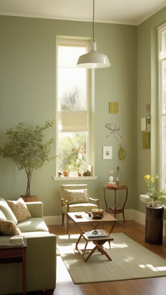
6) Light Sage Green (Fresh, Soft, and Weirdly Flattering)
Sage green loves sunlight. The windows pull out the natural, botanical vibe and make the room feel peaceful instead of gloomy. I like light sage when I want color, but I still want the space to feel neutral-ish.
Ever walk into a room and instantly exhale? Sage can do that.
- Best for: earthy palettes, lots of plants
- Pairs well with: warm white trim, oak, linen
- Avoid if: you hate any hint of gray-green (test it on multiple walls)
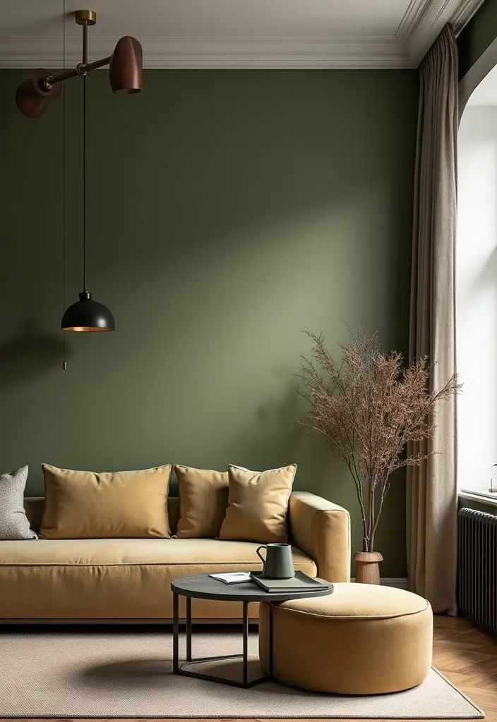
7) Olive Green (Moody, But Not Cave Energy)
Olive brings drama in the best way, and natural light keeps it from feeling too heavy. Bright rooms let olive look rich and grounded, like a fancy library that still welcomes snacks. I love olive when a living room needs structure and depth.
Do you want cozy sophistication without painting everything black? Olive delivers.
- Best for: large rooms, tall ceilings, big windows
- Pairs well with: caramel leather, brass, creamy whites
- Skip if: your room faces north and already feels cool (olive can turn dull)
8) Dusty Blue (Calm Without Feeling Cold)
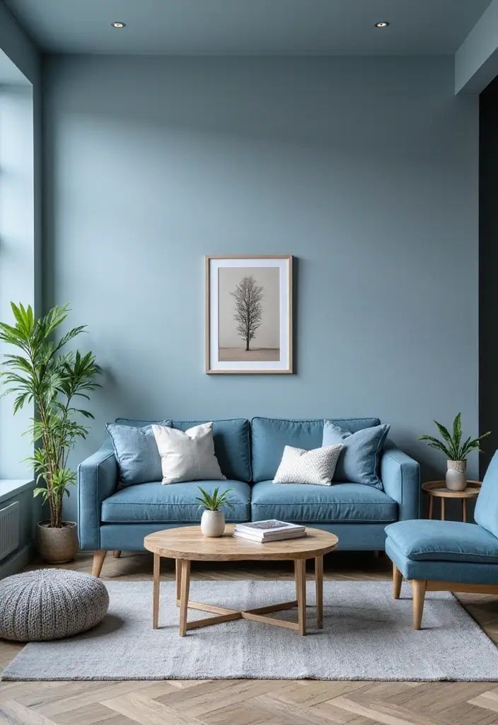
Dusty blue gives you that relaxed, lived-in look. In lots of natural light, it reads airy and soft instead of icy. I’ve used dusty blue in sunny rooms where I wanted calm energy but still wanted the walls to feel “designed.”
Do you want a color that feels like a deep breath? Dusty blue plays that role.
- Best for: casual living rooms, coastal vibes
- Pairs well with: white trim, natural wood, woven textures
- Watch out for: overly gray blues, which can look flat in harsh sun
9) Muted Navy (Bold, But Sun-Friendly)
Navy in a bright living room feels intentional and polished, not oppressive. Natural light adds dimension, so the walls shift from deep to velvety throughout the day. I love navy behind a gallery wall because it makes frames and art look extra crisp.
Ever wanted a bold wall color that still feels classic? Navy fits.
- Best for: statement walls, built-ins, fireplace surrounds
- Pairs well with: white trim, gold accents, warm woods
- Avoid if: your room has very little contrast in decor (navy needs light pieces around it)
10) Smoky Teal (The “Cool Friend” Color)
Smoky teal brings personality without screaming for attention. Sunlight helps it glow a little, but the smoky tone keeps it grounded. I recommend teal when someone says, “I want color, but I fear regret.” Fair.
Do you want a living room that feels creative but still grown-up? Teal handles that balance.
- Best for: eclectic spaces, mid-century style
- Pairs well with: walnut, tan leather, creamy whites
- Skip if: you already have bright blue upholstery (you can overload the room)
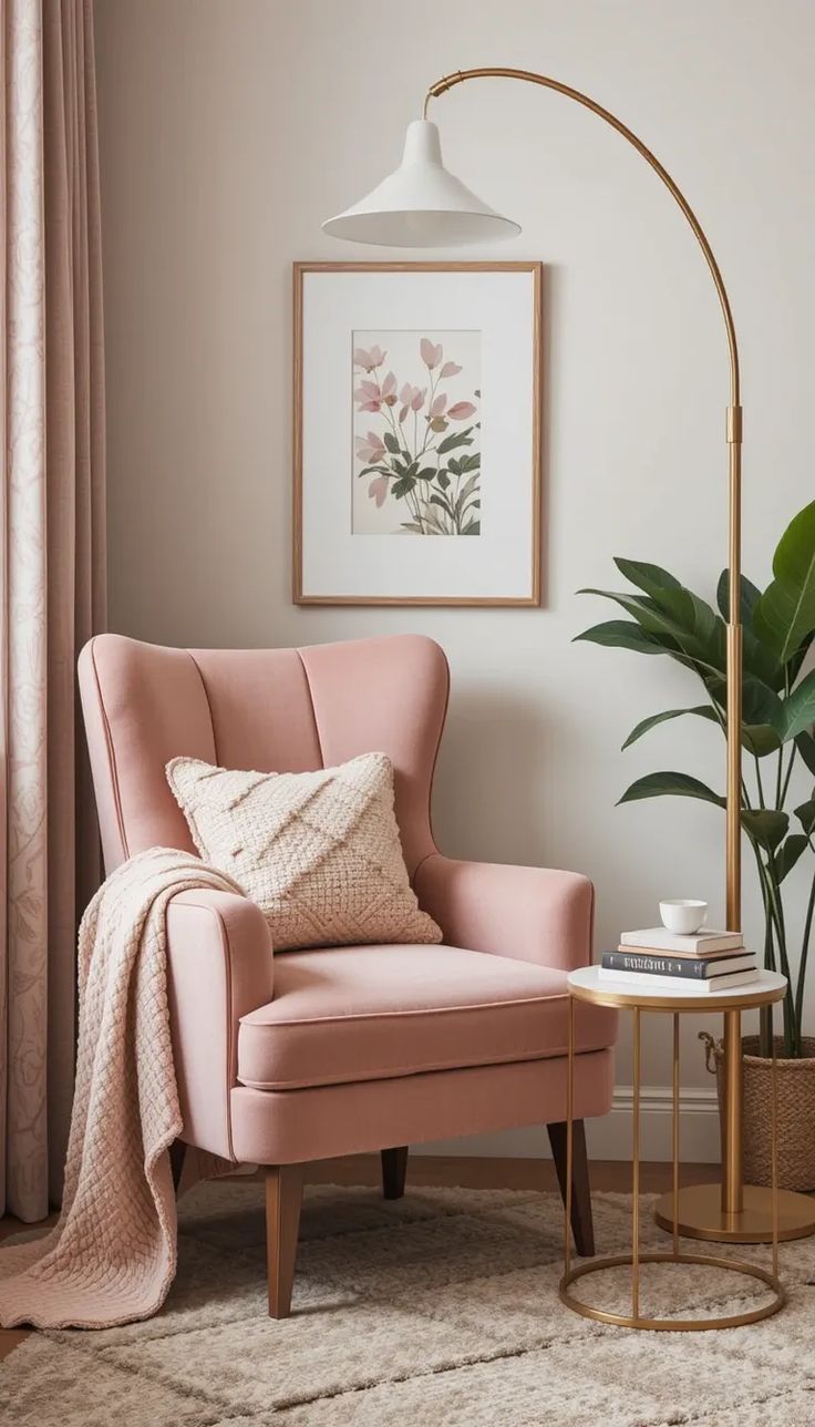
11) Blush Beige (Soft Pink That Acts Like a Neutral)
Before you panic: blush beige doesn’t turn your living room into a dollhouse. In a bright space, it reads warm, flattering, and subtle—especially with the right undertone. I’ve seen this color make skin tones look great in photos, which sounds shallow until you live with it 🙂
Do you want warmth without yellow? Blush beige gives you that option.
- Best for: cozy modern, vintage touches
- Pairs well with: creamy whites, walnut, soft black accents
- Watch out for: strong pink undertones if you hate any rosy vibe
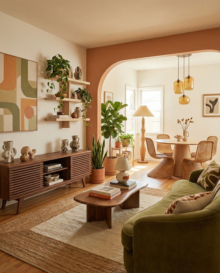
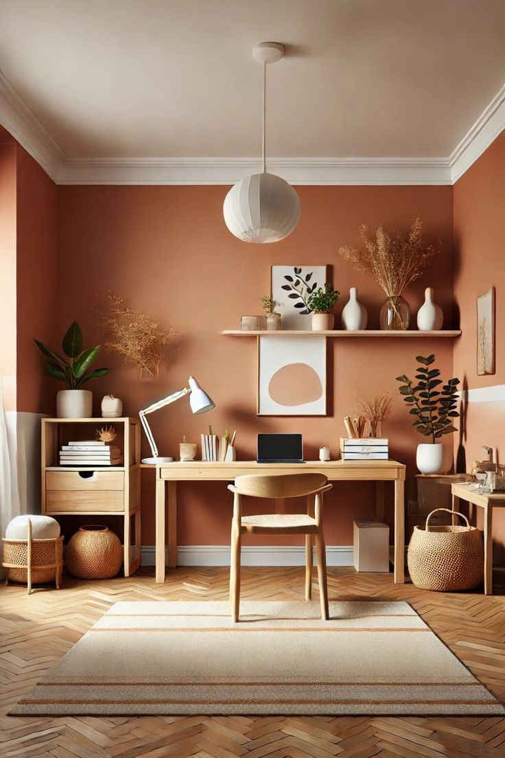
12) Warm Terracotta (Sunlight’s Best Friend)
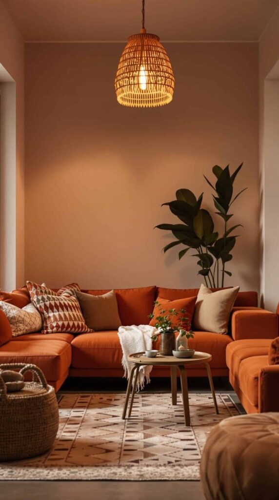
Terracotta and natural light go together like coffee and quiet mornings. Bright windows pull out the earthy warmth and make the room feel vibrant, not dark. I love terracotta in living rooms with neutral furniture because the walls do the heavy lifting.
Do you want your room to feel warm and inviting year-round? Terracotta delivers instant energy.
- Best for: boho, Mediterranean, desert modern
- Pairs well with: ivory textiles, greenery, natural woods
- Avoid if: your floors already run very orange (you can push it too far)
13) Soft Charcoal (Yes, Dark Walls Work in Bright Rooms)
People fear charcoal because they imagine a gloomy cave. Natural light fixes that. In a sunny living room, charcoal looks modern, cozy, and high-contrast, and it makes white trim look extra sharp. I like it when a space needs drama and a little “wow.”
Ever wanted your art and furniture to look more expensive without buying anything new? Charcoal can pull that trick.
- Best for: big rooms, high ceilings, lots of windows
- Pairs well with: crisp white trim, warm woods, textured rugs
- Skip if: you hate seeing scuffs (darker walls demand a bit more touch-up love)
Quick Tips to Choose the Right Paint Color (Without Losing Your Mind)
Even the best living room paint colors for natural light can flip on you if you skip testing. I always sample first, and I always check the color next to the biggest stuff in the room—sofa, rug, floors. Do you really want to repaint because your rug suddenly looks neon?
Use this simple process:
- Test 3–5 samples on poster boards or directly on the wall
- Move the samples around the room (light changes everything)
- Check morning, midday, and night under your lamps
- Match undertones to fixed finishes (floors, stone, cabinets)
Conclusion: Let the Sun Work for You
You can absolutely pick the perfect paint colors for living room spaces with lots of natural light—you just need colors that handle brightness like a pro. Warm whites, smart neutrals, earthy greens, dusty blues, and even bold charcoal can look incredible when sunlight hits them all day. Natural light gives you flexibility, so you can go lighter for airiness or darker for drama without the doom-and-gloom side effects.
Grab a few samples, watch them through the day, and trust your eyes more than the tiny store swatch. Then paint with confidence—because your living room already does the hard part by showing up with all that gorgeous light.