14 Interior Paint Colors That Pair Perfectly With White Trim
White trim acts like the friend who shows up overdressed and still somehow makes everyone else look better. So if you stare at your white baseboards and wonder why your wall color suddenly looks… weird, you don’t need a whole identity crisis—you just need the right paint color.
I’ve painted more rooms than I care to admit, and I’ve learned one thing the hard way: white trim exposes everything. Wrong undertone? White trim snitches. Bad lighting? White trim points it out like it earns commission.
So let’s talk about interior paint colors that pair perfectly with white trim—the ones that actually look intentional, stylish, and not like you panic-painted at 9 p.m. the night before guests arrived.
Quick “Don’t Regret This Later” Tips for White Trim + Wall Color
Before we jump into the fun stuff, can we save you from the classic “why does this look green now?” moment?
Here’s what I always check first:
- Pick your trim white first. Bright whites look crisp; creamy whites look softer. Your wall color will react to that choice.
- Match undertones on purpose. Warm walls + warm whites feel cozy. Cool walls + bright whites feel clean.
- Test paint next to the trim. You don’t paint walls in a vacuum, right?
Ever noticed how a color looks perfect online and then acts completely different in your living room? Lighting loves drama.
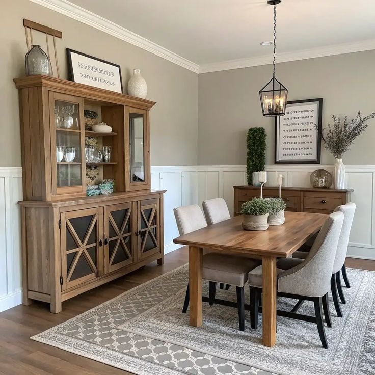
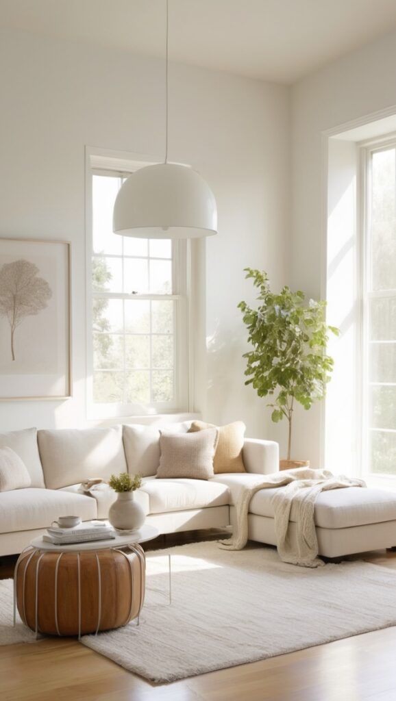
1) Warm Greige (That “I Have My Life Together” Neutral)
Warm greige hits that sweet spot between gray and beige, and white trim makes it look polished instead of blah. I love this combo when I want calm but not cold.
- Why it works: Greige gives the room warmth; white trim adds crisp contrast.
- Best rooms: Living rooms, hallways, open-concept spaces.
- Pro tip: Choose a greige with a soft beige undertone if your trim leans creamy.
Want a wall color that plays nice with literally everything you own? This one says “yes” without being annoying about it.
2) Soft Sage Green (Relaxed, Not “I Live in a Forest”)
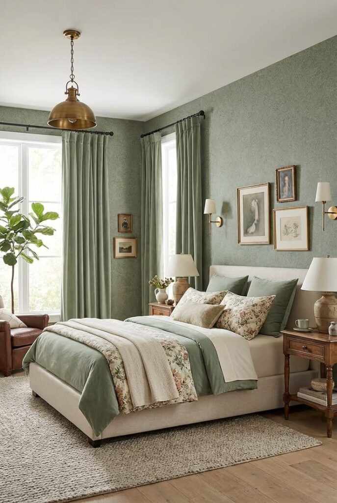
Soft sage looks fresh and grounded next to white trim. It gives you color without screaming “theme room.” And yes, it looks amazing with plants—because of course it does.
- Why it works: Sage adds gentle color; white trim sharpens the edges.
- Best rooms: Kitchens, bedrooms, laundry rooms.
- Pro tip: Keep sage muted so the trim stays bright, not harsh.
Do you want your room to feel calm without putting everyone to sleep?
3) Dusty Blue (Classic, Cozy, and Slightly Moody)
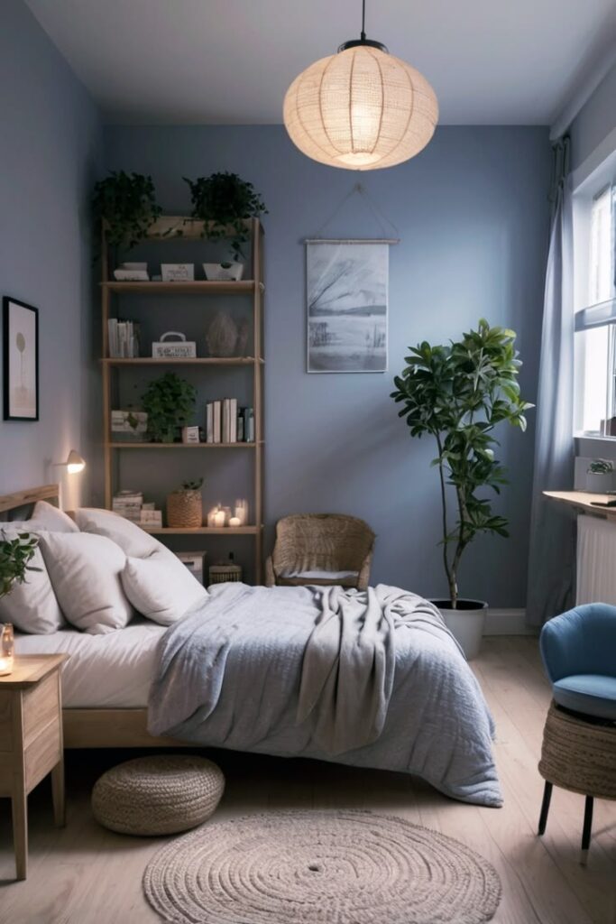
I’ve used dusty blue in a guest room, and people suddenly acted like I ran a boutique hotel. White trim makes dusty blue look intentional and clean.
- Why it works: Blue brings depth; white trim keeps it airy.
- Best rooms: Bedrooms, offices, reading nooks.
- Pro tip: Choose a blue with a gray base to avoid baby-room vibes.
If you want “cozy” without “cabin,” dusty blue nails it.
4) Creamy Beige (Yes, Beige Can Look Expensive)
Beige gets a bad rap because people pick the wrong beige. A creamy beige with the right undertone looks warm and inviting, and white trim keeps it from feeling dull.
- Why it works: Beige adds softness; white trim adds structure.
- Best rooms: Family rooms, dining rooms, rentals.
- Pro tip: Skip yellow-heavy beige unless you love the “butter hallway” look.
Do you want your home to feel welcoming the second you walk in?
5) Charcoal Gray (Because Sometimes You Want Drama)
Charcoal walls with white trim create instant architecture. The trim pops, the walls recede, and the whole room looks designed—even if you just moved the couch twice and called it a day.
- Why it works: Charcoal adds bold contrast; white trim looks ultra-crisp.
- Best rooms: Dining rooms, offices, powder rooms.
- Pro tip: Use warmer lighting so charcoal doesn’t feel cold.
Who says neutral has to mean “safe”?
6) Soft Taupe (The Quiet Luxury Neutral)
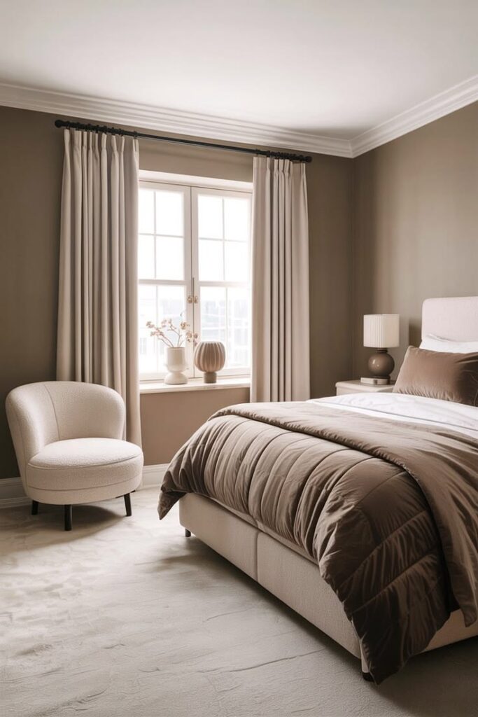
Soft taupe gives you warmth with a touch of sophistication. I use it when I want a neutral that still feels grown-up next to white trim.
- Why it works: Taupe balances warm and cool; white trim boosts the clean lines.
- Best rooms: Primary bedrooms, living rooms.
- Pro tip: Pick taupe with a subtle gray undertone for modern vibes.
Ever want a neutral that doesn’t feel like builder-grade surrender?
7) Muted Terracotta (Warmth Without the 2002 Tuscan Flashback)
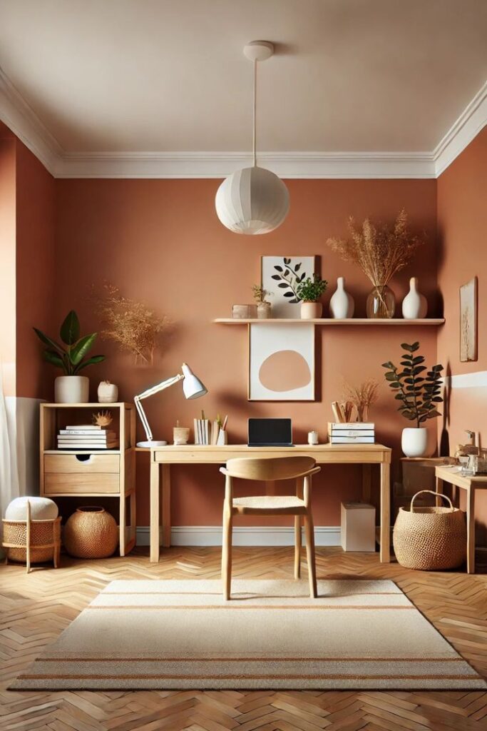
Hear me out: muted terracotta looks incredible with white trim when you keep it soft and earthy. It reads cozy and curated, not “olive garden lobby.”
- Why it works: Terracotta brings warmth; white trim keeps it fresh.
- Best rooms: Dining rooms, entryways, accent walls.
- Pro tip: Choose “dusty clay” tones, not bright orange.
Do you want your room to feel like a hug, but like… a tasteful hug?
8) Navy Blue (Crisp, Bold, and Weirdly Timeless)
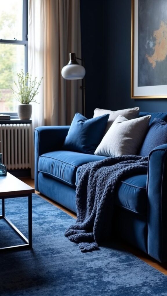
Navy with white trim always looks sharp. It gives coastal energy without forcing you to buy rope décor (please don’t).
- Why it works: Navy creates depth; white trim adds high-contrast polish.
- Best rooms: Offices, dining rooms, mudrooms.
- Pro tip: Paint the ceiling white to keep navy from feeling heavy.
FYI, navy looks even better when you add warm wood tones.
9) Pale Blush (Not Pink-Pink, More “Soft Glow”
Pale blush paired with white trim looks light, warm, and flattering. I like it in rooms where I want softness without going full cotton candy.
- Why it works: Blush warms the space; white trim keeps it crisp.
- Best rooms: Bedrooms, nurseries, bathrooms.
- Pro tip: Choose blush with a beige base for a more mature look.
Ever walked into a room and instantly felt calmer? Blush can do that.
10) Light Cool Gray (Clean and Minimal, Not Sad)
A light cool gray can look sleek with white trim, especially if you love a modern, clean vibe. You just have to avoid grays that lean blue in warm lighting.
- Why it works: Cool gray feels modern; white trim amplifies brightness.
- Best rooms: Bathrooms, modern living rooms, condos.
- Pro tip: Test it at night because warm bulbs can shift it fast.
Do you want “fresh and simple” without “waiting room”?
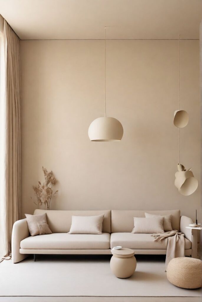
11) Warm White (For People Who Want White Walls Without the Stark Look)
Yes, you can paint walls “white” with white trim and still create contrast. Warm white walls look creamy and soft, while true white trim looks clean and defined.
- Why it works: Warm white adds softness; bright trim draws the outlines.
- Best rooms: Whole-house color schemes, small rooms.
- Pro tip: Use two different whites—one for walls, one for trim.
IMO, this combo looks the most “designer” for the least effort 🙂
12) Deep Forest Green (Moody, Rich, and Surprisingly Neutral)
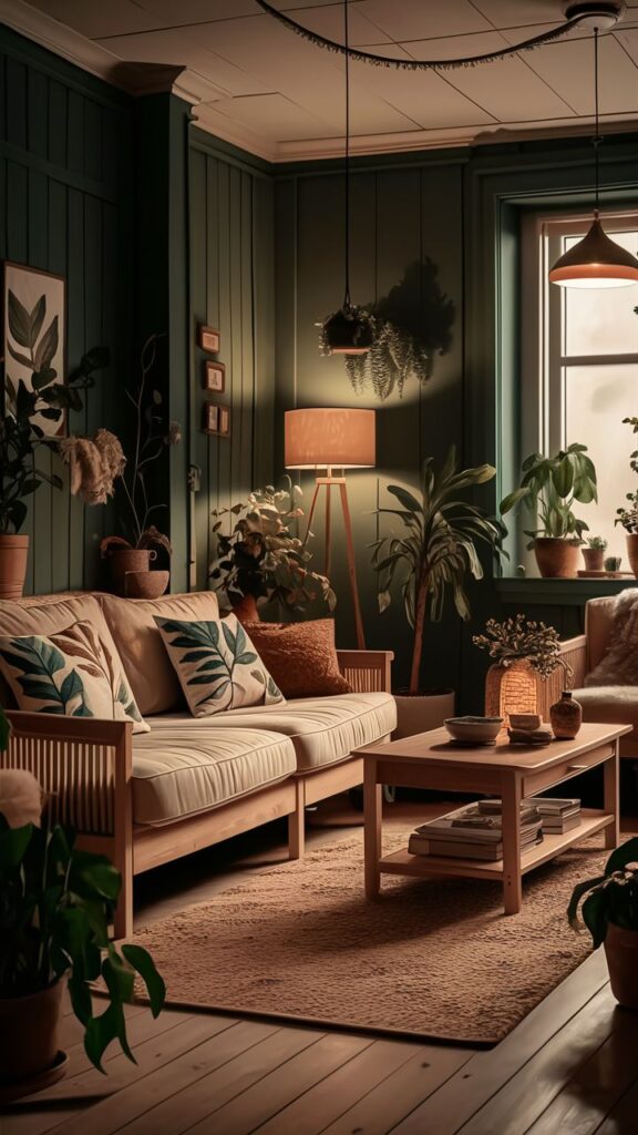
Forest green with white trim looks bold but classic. I love it when I want a statement color that still feels grounded.
- Why it works: Green adds richness; white trim keeps it tailored.
- Best rooms: Libraries, dining rooms, offices.
- Pro tip: Add brass or warm metals to make it feel luxe.
Who needs wallpaper when paint can pull this much weight?
13) Lavender-Gray (Soft Color for People Who “Don’t Like Color”)
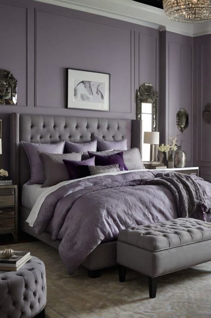
Lavender-gray sounds scary until you see it next to white trim. It reads soft, airy, and slightly dreamy—like a neutral with personality.
- Why it works: Lavender adds a hint of color; white trim keeps it clean.
- Best rooms: Bedrooms, creative spaces, bathrooms.
- Pro tip: Avoid super-saturated purple tones unless you want chaos.
Ever want something different but still subtle enough to live with?
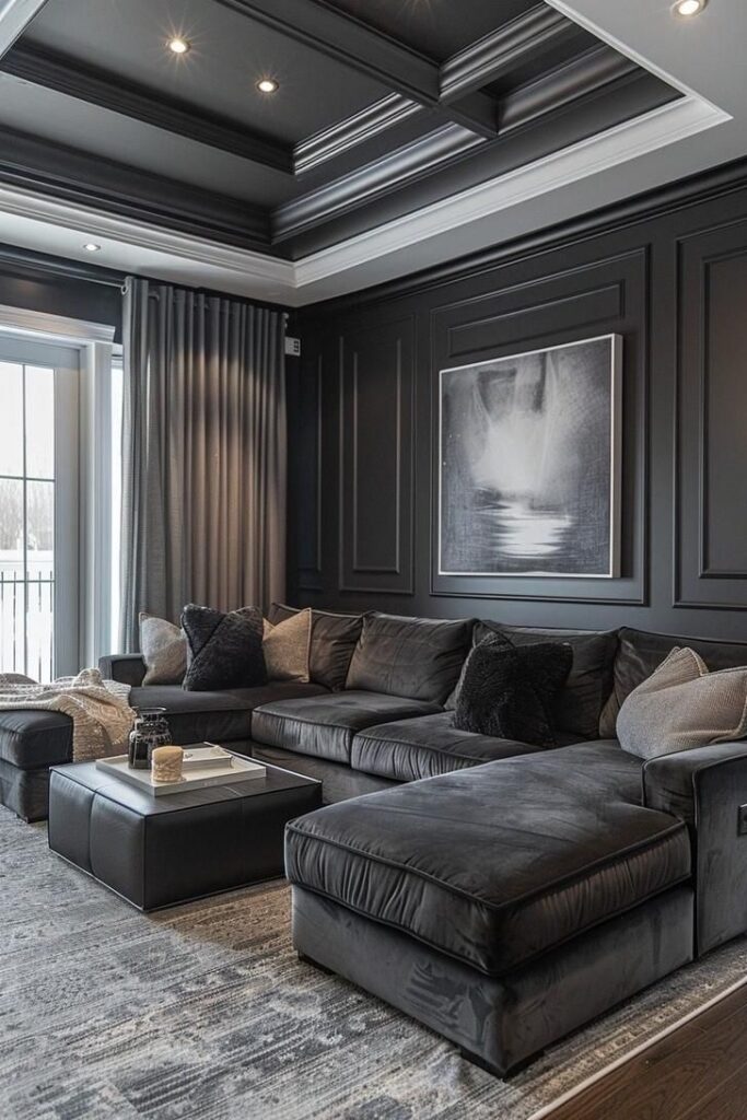
14) Soft Black (Yes, Really)
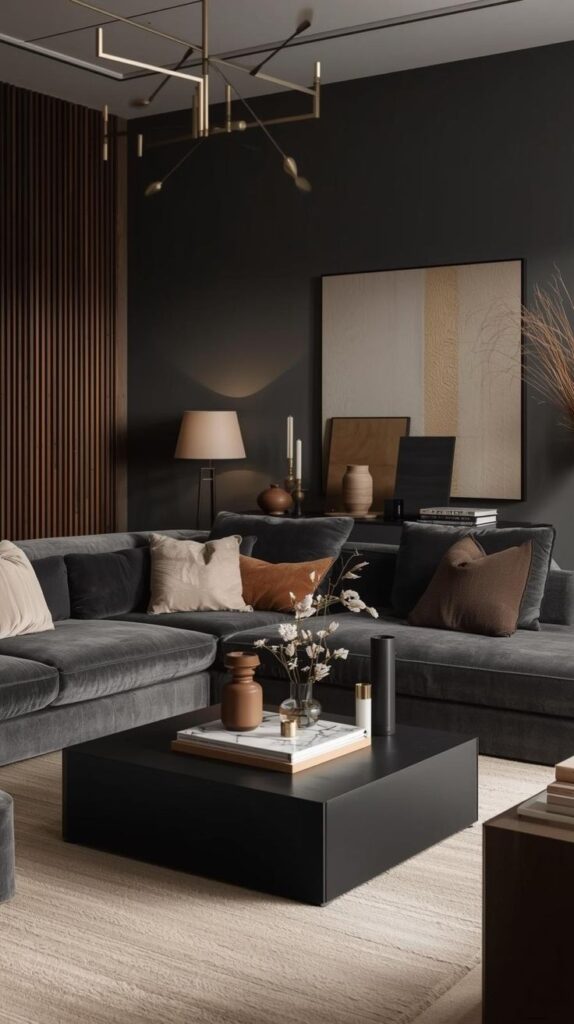
Soft black (think charcoal-black, not “void of space”) makes white trim look insanely crisp. You get instant contrast, instant style, and instant “wow, you meant to do that.”
- Why it works: Black creates drama; white trim looks graphic and sharp.
- Best rooms: Powder rooms, offices, accent walls, modern homes.
- Pro tip: Use a matte or velvet finish to keep it rich, not shiny.
Do you want your trim to look like custom millwork without paying custom millwork money?
How to Choose the Best Wall Color for Your White Trim (Without Overthinking It)
You don’t need a PhD in undertones. You just need a quick reality check before you commit.