12 Living Room Paint Color Ideas That Instantly Warm Up Any Space
Your living room feels cold, flat, or weirdly “office waiting room,” and you want it to feel cozy fast. I get it. I once painted a living room a crisp white because I thought I wanted “clean,” and I ended up with a space that felt like it wanted to sell me health insurance.
The good news: you don’t need new furniture, a new rug, and a new personality. You need the right warm living room paint color—one that plays nice with your light, your floors, and your actual life (kids, pets, takeout containers… the whole vibe). Ready for living room paint color ideas that instantly warm up any space?
1) Creamy Ivory (Not Stark White’s Annoying Cousin)
If you want bright walls without the icy glare, choose creamy ivory. It gives you that airy look while still reading warm, especially at night when lamps do the heavy lifting. Ever notice how some whites turn blue the second the sun dips? Yeah, this avoids that drama.
I love creamy ivory in smaller living rooms because it bounces light around without feeling sterile. It also makes wood tones look richer, which feels like cheating (in a good way).
Try this combo:
- Pair with warm white trim (not bright “printer paper” white)
- Add brass or wood accents for instant warmth
- Pick an eggshell finish for walls so they look soft, not shiny
2) Warm Greige (The “I Have My Life Together” Neutral)
Warm greige gives you the best of beige and gray without turning your room into a rainy day. It reads calm, modern, and still cozy. People fight about beige vs. gray online like it counts as a sport, so greige settles the argument.
I reach for warm greige when I want the furniture to stand out. It also helps open floor plans flow without shouting for attention.
Greige works best when you:
- Choose a shade with taupe or beige undertones
- Test it in morning and evening light (seriously)
- Layer in creamy textiles so it doesn’t feel flat
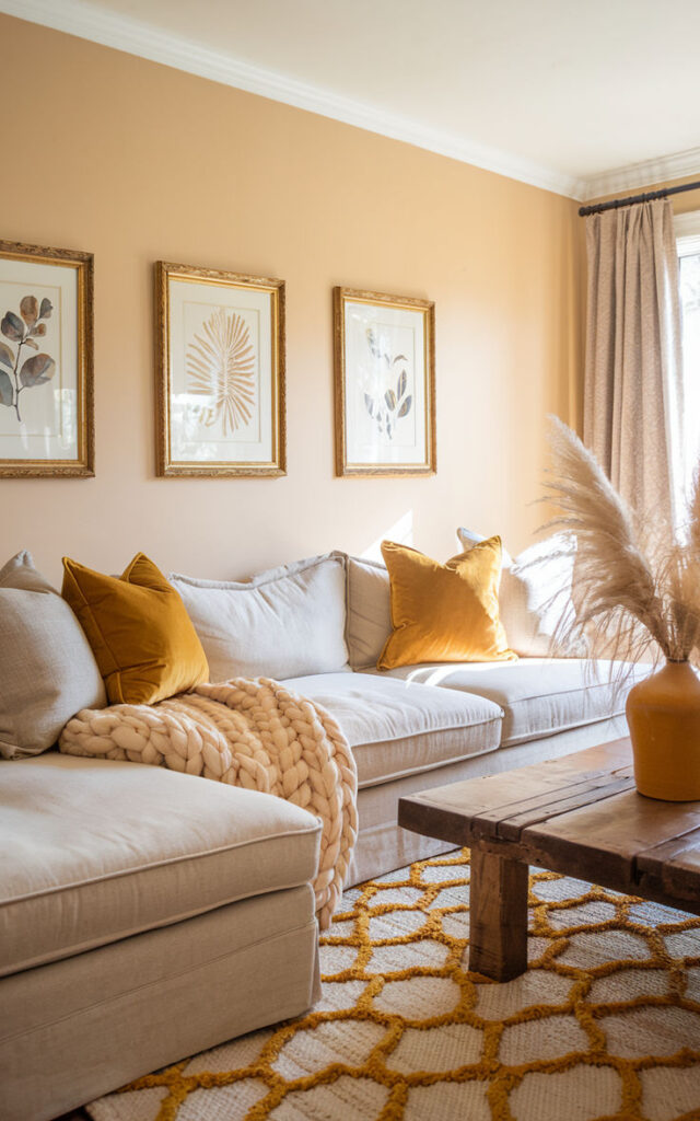
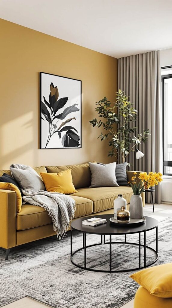
3) Honey Beige (Cozy Without Looking “Builder Basic”)
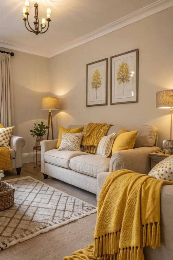
Honey beige warms up a space instantly, especially if you deal with north-facing light. It feels welcoming, not dated—assuming you avoid the super yellow versions that scream early-2000s rental.
I painted a rental once with a honey beige, and the room finally felt like it belonged to humans. The color made my bargain sofa look way more expensive than it deserved.
Make honey beige look intentional:
- Add white oak, walnut, or rattan tones
- Use matte paint if you want a modern feel
- Contrast with black accents for a clean, grounded look
4. Soft Blush Pink (Yes, Really)
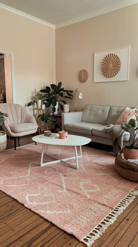
Before you say “absolutely not,” hear me out. Soft blush reads like warmth and light, not bubblegum. It acts like a gentle filter over the whole room, especially with warm bulbs.
Do you want cozy without going darker? Blush pulls it off. It also plays surprisingly well with neutrals and plants.
Blush looks grown-up when you:
- Keep it muted (think dusty rose, not cotton candy)
- Pair with cream, camel, and warm gray
- Add aged brass for a soft-glow effect
5) Terracotta (Instant Warmth, Zero Apologies)
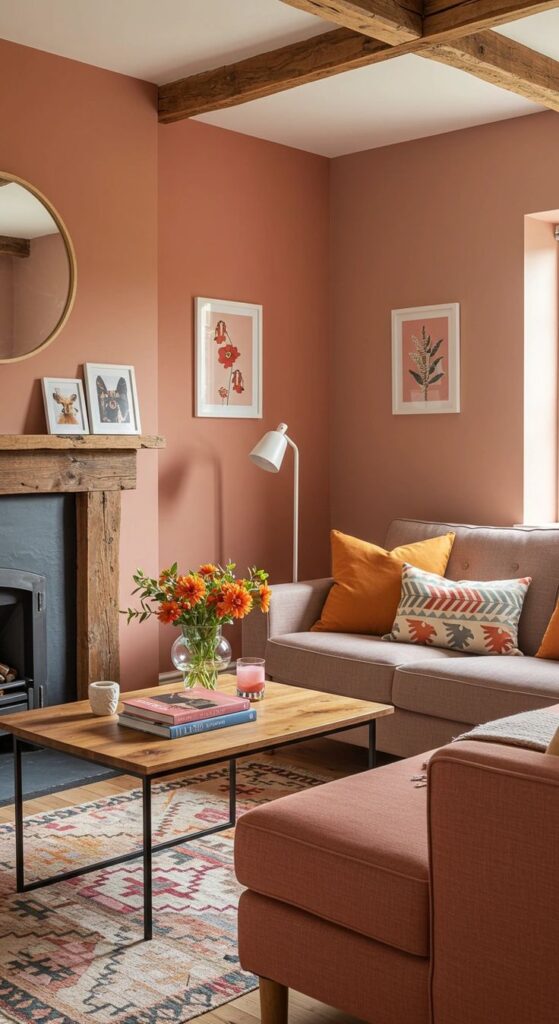
Terracotta brings that sunbaked, earthy warmth that makes a room feel grounded. It also hides scuffs and life mess better than pale colors—FYI if you live with kids, dogs, or a partner who “doesn’t see” fingerprints.
I like terracotta when I want the room to feel like it has a heartbeat. It turns even basic furniture into a vibe.
Terracotta tips:
- Balance with linen, ivory, and natural wood
- Use warm white ceilings so it doesn’t feel heavy
- Add green plants for an easy color contrast
6) Cinnamon Brown (Warm, Rich, and Surprisingly Modern)
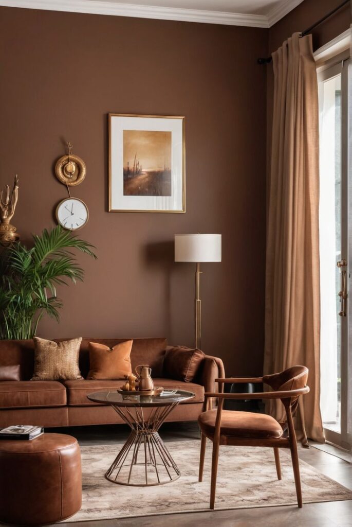
Cinnamon brown wraps a living room in warmth like a good throw blanket. It looks especially good in rooms with lots of natural textures—wood beams, leather, woven anything. Want cozy but still sleek? Cinnamon pulls that off.
I used a cinnamon tone in a reading nook once, and I actually started reading more. Coincidence? Maybe. Magic paint? Also maybe.
Keep cinnamon from feeling too dark:
- Use lighter rugs and curtains
- Add warm lighting with soft shades
- Choose satin or eggshell so the color looks deep, not dusty
7) Golden Ochre (Like Sunshine, Not Like a Highlighter)
Golden ochre gives you warmth and brightness at the same time. It feels cheerful without looking childish, and it flatters wood floors like it trained for the job. Ever walk into a room and instantly feel happier? Ochre can do that.
IMO, this works best when you keep everything else simple. Let the wall color act as the personality.
Ochre plays well with:
- Crisp cream trim (not icy white)
- Navy, charcoal, and forest green accents
- Natural fiber rugs to keep it earthy
8) Olive Green (Earthy, Cozy, and Easy to Live With)
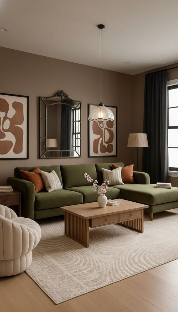
Olive green warms a space in a quieter way. It feels calming and grounded, and it makes your living room look curated even if you just tossed a blanket over a chair and called it “styling.”
I love olive because it acts like a neutral but still brings color. It also looks great with vintage pieces and modern pieces, which saves you from redecorating your entire life.
Olive green wins when you:
- Pair with warm wood and creamy whites
- Add black metal for contrast
- Use soft lighting so it stays cozy at night
9) Deep Teal (Moody Warmth Without Going Full Cave)
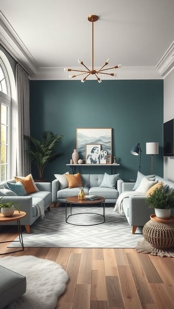
Deep teal adds richness and warmth while still feeling fresh. It sits in that sweet spot where you get drama, but you keep it livable. Do you want a statement wall that still feels inviting? Teal answers that question.
I’ve seen teal make basic beige sofas look intentional, which feels almost unfair.
Make teal feel warm:
- Add tan leather or camel accents
- Use gold/brass hardware to amplify the glow
- Choose warm bulbs so it doesn’t lean icy
10) Warm Navy (Classic, Cozy, and Not Try-Hard)
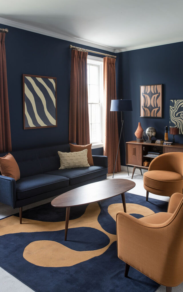
Warm navy gives you depth without sucking the life out of the room. It looks timeless, it hides marks, and it makes art and trim pop. Plus, it gives you that “fancy living room” feeling even if your coffee table holds three remotes and a questionable candle.
I like warm navy in rooms with good natural light, but you can still pull it off in darker spaces if you layer lighting.
Navy looks warmer when you:
- Pick a shade with brown or red undertones
- Pair with cream, tan, and walnut
- Add multiple light sources (lamps > overhead glare)
11) Aubergine / Deep Plum (Warm Drama That Feels Luxe)
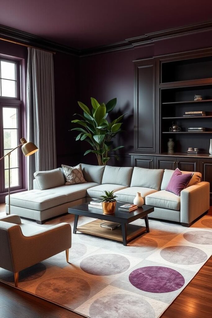
Deep plum brings warmth in a bold, velvety way. It feels cozy, creative, and a little unexpected—like you know what you’re doing, even if you picked the color at midnight. Want a room that feels “designed” without trying too hard?
I love plum in living rooms with lots of texture: velvet pillows, chunky knits, and wood grain. The color makes everything feel richer.
Plum styling ideas:
- Pair with soft blush, cream, or taupe
- Add brass and dark wood for depth
- Keep trim warm white so it feels intentional 🙂
12) Warm Charcoal (The Cozy Alternative to Flat Gray)
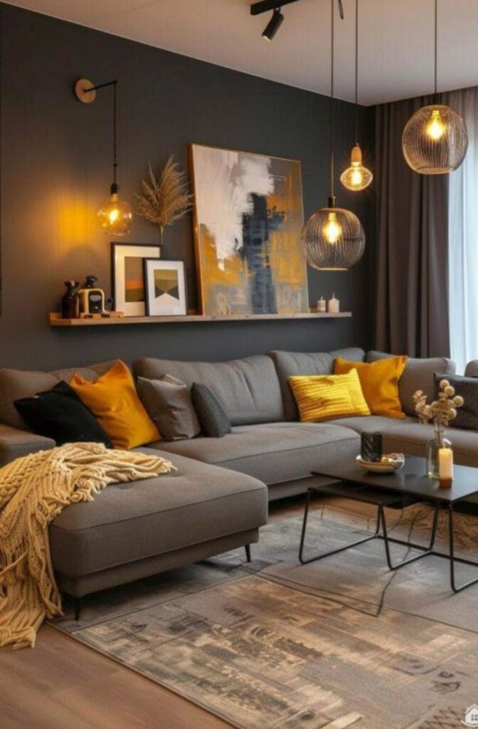
Cool gray had its moment, and then it made a lot of living rooms feel like cloudy weather. Warm charcoal fixes that. It gives you sophistication and contrast while still feeling inviting—especially when it carries a brown undertone.
I like warm charcoal when I want a modern look without the icy vibe. It also makes fireplaces and built-ins look incredible.
Warm charcoal works when you:
- Choose a shade with brown or purple undertones
- Layer cream, caramel, and wood tones
- Add soft textures so the room feels welcoming, not harsh
Wrap-Up: Pick Warmth That Matches Your Real Life
You don’t need a complicated plan to get a cozy space. You just need a color that brings warmth, matches your lighting, and supports your furniture and floors. Start with creamy ivory or warm greige if you want safe, then jump to terracotta, olive, or deep teal if you want personality.
.Grab a few sample pots, paint big swatches, and check them at night—because your living room doesn’t host most of its hangouts at noon, right? Choose the color that makes you want to kick off your shoes and stay awhile, and your space will finally feel warm instead of “mildly judgmental showroom