15 Paint Colors for Home That Make Small Rooms Look Bigger
Small rooms love to play mind games. One day they feel “cozy,” and the next day they feel like a shoebox that charges rent. Sound familiar?
I’ve painted my way out of a few cramped corners (including one tiny guest room that somehow swallowed a whole dresser), and I can tell you this: the right paint color can make a small room look bigger fast—without knocking down walls or selling your furniture on Facebook Marketplace.
So, what colors actually help your space breathe? And which ones quietly betray you? Let’s talk.
Why paint color can “stretch” a room (no gym membership required)
Paint changes how your eyes read the edges of a room. Light-reflecting colors bounce more light, so corners look softer and walls feel farther apart. Darker or muddy colors pull the walls inward and highlight every shadow like it wants attention.
Ever notice how a bright day makes your room feel bigger than a cloudy day? Same idea. Paint basically fakes good lighting. Who doesn’t want that?
Also, your brain loves continuity. When walls, trim, and ceilings flow together, you stop seeing hard borders. You start seeing space.
The quick rules I follow before I pick a color
You can absolutely pick a color because it “feels right.” I do that too. But I also use a few simple guardrails so I don’t end up repainting on a Sunday night (again).
Aim for higher LRV (aka “how much light it reflects”)
Paint companies measure light reflectance value (LRV). Higher numbers reflect more light, which helps small rooms look bigger.
- Look for LRV 60+ for most small rooms
- Go 70–85 when the room gets little natural light
- Use lower LRV only if you plan to lean into moody-on-purpose (and accept the cozy cave vibe)
FYI, you don’t need to obsess over the number. Use it as a shortcut, not a personality trait.
Choose a finish that helps, not one that highlights your wall sins
I love a velvety matte look… until I remember drywall exists.
- Eggshell: my go-to for small rooms; soft, cleanable, not shiny
- Satin: great for bathrooms and busy hallways; reflects more light
- Flat/matte: pretty, but it can look dull in low light and it marks easily
Match your whites and undertones (so the room stops fighting itself)
Undertones matter. A “white” with a pink undertone can make a gray look green. Yep, paint loves chaos.
Ask yourself: Do you want the room to feel warm, cool, or neutral? Then stick to that lane.
15 paint colors for home that make small rooms look bigger
These shades all share one job: they brighten, soften edges, and push walls outward visually. I’ll give you the vibe, where they work best, and how I’d style them.
1) Crisp Clean White
This one gives instant “open, airy, fresh start.” It also makes trim, art, and furniture pop without trying too hard.
- Best for: tiny offices, hallways, laundry rooms
- Pair with: light wood, black accents, simple curtains
- Pro tip: pick a white that matches your trim so everything flows
2) Soft Warm White
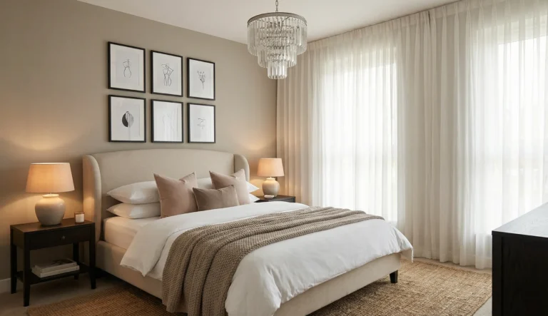
Warm white feels friendlier than stark white, especially at night. It makes small bedrooms feel calm instead of clinical.
- Best for: bedrooms, nurseries, living rooms
- Pair with: beige linens, warm metals, natural textures
- Watch out: don’t mix it with icy grays unless you enjoy visual tension
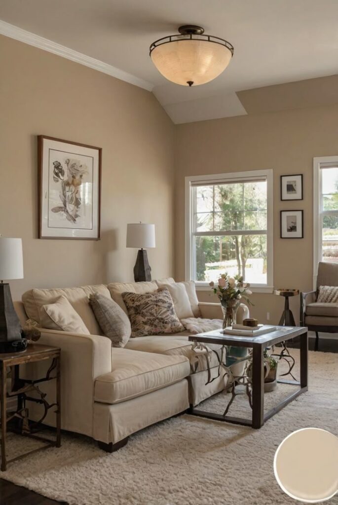
3) Creamy Off-White
Cream adds softness and warmth, which helps when a room lacks sunlight. I used this in a north-facing room and it stopped looking like a sad box at 4 p.m.
- Best for: darker rooms, older homes, cozy spaces
- Pair with: oak, rattan, brass, creamy curtains
- Bonus: it hides minor wall flaws better than pure white
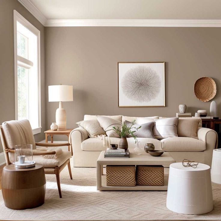
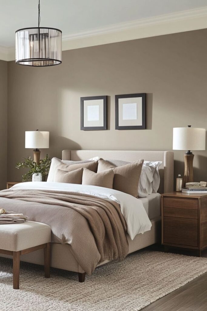
4) Pale Greige (Gray + Beige)
Greige gives you the clean look of gray without the cold vibe. It makes small rooms look bigger while still feeling “designed.”
- Best for: open-plan areas, bedrooms, entryways
- Pair with: white trim, linen textiles, soft black hardware
- My take: IMO, greige saves more paint decisions than any other shade
5) Light Silver Gray
A light silver gray reads modern and polished. It pushes walls back visually when you keep it airy and uncluttered.
- Best for: bathrooms, small kitchens, minimalist spaces
- Pair with: bright white trim, chrome, glass
- Tip: test it at night because some silvery grays turn blue fast
6) Pale Mushroom Taupe
This one sounds boring until you see it on a wall. It feels calm, soft, and upscale, and it avoids the yellow-y beige problem.
- Best for: small living rooms, dining nooks, hallways
- Pair with: warm woods, ivory upholstery, woven textures
- Why it works: it keeps contrast low, so the room reads wider
7) Soft Sand Beige
Sand beige gives you warmth without heaviness. It plays nice with almost everything, which matters when the room doesn’t give you many layout options.
- Best for: family rooms, guest rooms, rentals
- Pair with: white trim, tan leather, plants
- Tip: keep ceilings bright to avoid the “toast” effect
8) Barely-There Blush
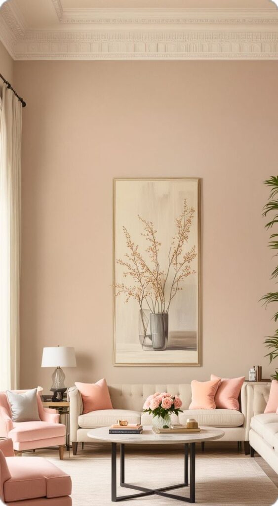
Blush sounds bold until you pick the right one. Think “warm neutral with a rosy glow,” not “bubblegum explosion.”
- Best for: powder rooms, bedrooms, dressing areas
- Pair with: warm whites, brass, light oak
- Fun fact: it flatters skin tones in mirrors way more than cool gray does 🙂
9) Whisper Lavender
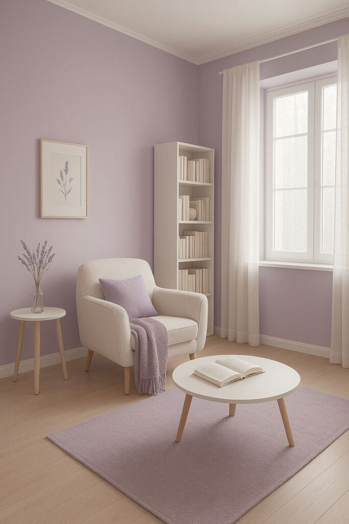
Lavender can read airy and elegant when you keep it pale. It adds personality without shrinking the room.
- Best for: small bedrooms, nurseries, creative studios
- Pair with: white trim, light gray bedding, silver accents
- Tip: choose a dusty lavender, not a saturated purple
10) Powder Blue
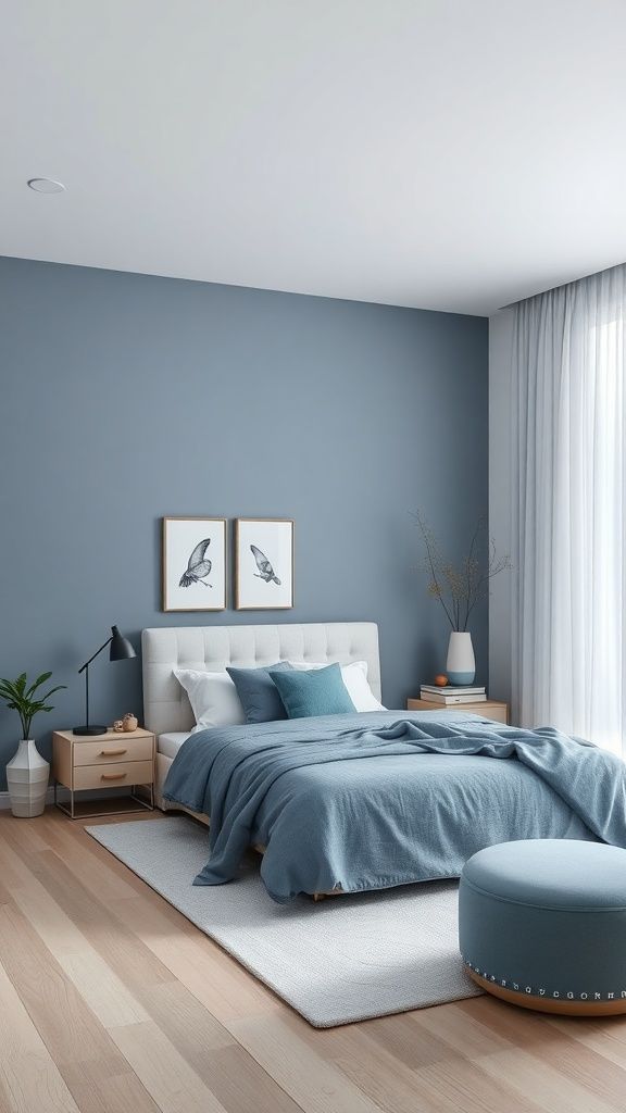
Powder blue gives “open sky” energy, which makes ceilings feel higher and walls feel farther away. It also calms busy rooms.
- Best for: bathrooms, small bedrooms, reading corners
- Pair with: crisp white, navy accents, light wood
- Tip: use warm lighting so it doesn’t turn icy
11) Pale Sky Blue
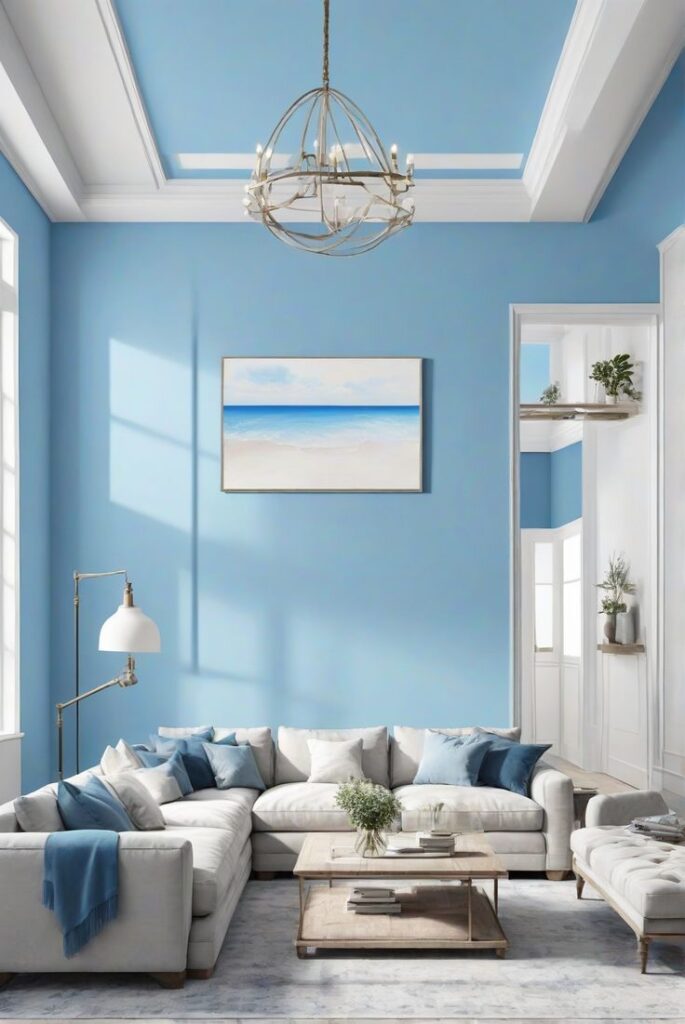
This shade looks a bit brighter than powder blue, and it works magic in tight spaces with limited windows.
- Best for: small home offices, narrow hallways
- Pair with: white trim, simple art, airy curtains
- Why it works: your eye reads it as daylight, even when the sun refuses to cooperate
12) Soft Seafoam Green
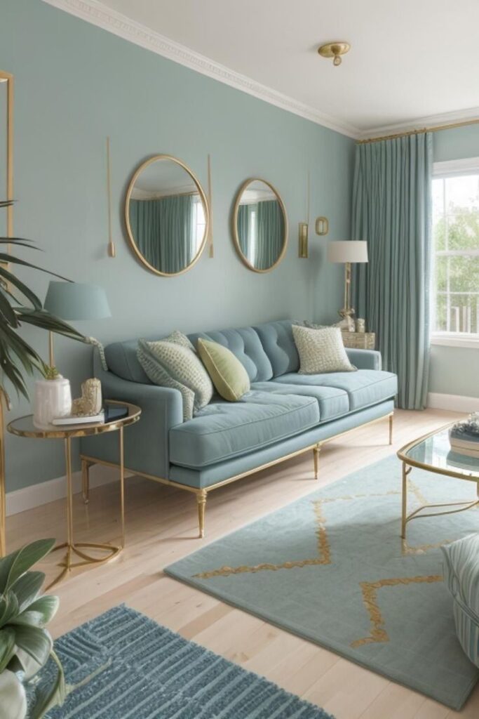
Seafoam gives a fresh, coastal feel without screaming “beach theme.” It reflects light well and makes corners feel softer.
- Best for: bathrooms, kitchens, sunrooms
- Pair with: white tile, warm wood, brushed nickel
- Tip: keep the decor simple so the color stays airy
13) Misty Sage
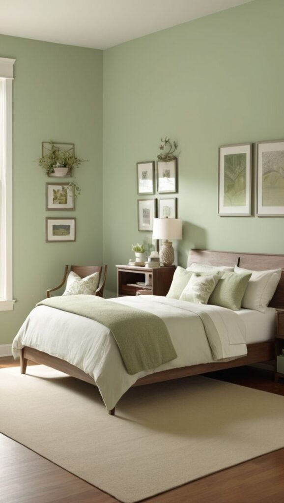
Sage feels grounded and gentle, and it still opens up a small room when you pick a light, muted version.
- Best for: bedrooms, living rooms, small dining areas
- Pair with: creamy whites, linen, black accents
- Why I like it: it adds color without making the walls close in
14) Pale Butter Yellow
Yellow gets a bad rap because people pick the loud ones. A soft buttery yellow reads like morning light, and it makes small rooms feel cheerful and bigger.
- Best for: kitchens, breakfast nooks, dark hallways
- Pair with: white trim, light wood, simple patterns
- Tip: skip neon undertones unless you enjoy living inside a highlighter
15) Soft Clay (Light Terracotta Beige)
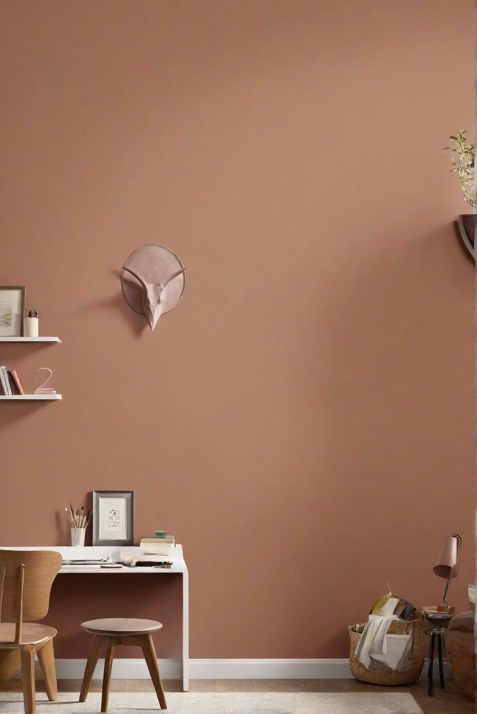
This one gives warmth and depth, but it still plays “expanding color” when you keep it light and muted. It feels cozy in a good way, not in a “walls closing in” way.
- Best for: bedrooms, living rooms, boho spaces
- Pair with: cream textiles, plants, natural wood
- Tip: use minimal contrast on trim for the biggest-space effect
Little paint tricks that make small rooms look bigger (even if the color already helps)
Want to squeeze every inch of “visual space” out of your paint job? Try these.
Paint the ceiling a brighter version of the wall
You can paint the ceiling white, but you can also paint it 50% lighter than the wall color. That trick lifts the room without creating a harsh border.
Ever stared at a dark line where the wall meets the ceiling and thought, “Wow, that looks shorter now”? Yeah. Avoid that.
Keep trim and walls closer in color
High-contrast trim looks crisp, but it can chop up a small room. I like this approach instead:
- Use same color trim in a satin finish for a seamless look
- Or choose trim that sits 1–2 shades lighter than the wall
You’ll keep the edges soft, and the room will look wider.
Use one color across connected spaces
If your hallway flows into a small living room, carry the color through. Fewer visual stops = more perceived space. Your eyes love an easy path.
Color choices that secretly shrink small rooms (so you can skip the regret)
Some colors look gorgeous on Pinterest and then bully your room in real life. I said what I said.
- Super dark colors in low light (they eat depth for breakfast)
- Muddy undertones (they make everything look dull and cramped)
- High contrast everywhere (it slices the room into little boxes)
- Bright, saturated hues on all four walls (fun, but not “bigger”)
Do you want drama or space? You can pick drama, but you can’t act surprised when the room feels smaller.
Final thoughts: pick light, pick soft, and let your room breathe
You don’t need a massive renovation to make a small room look bigger. You just need smart paint colors for home, a little undertone awareness, and a plan for light and trim.
Start with one of the 15 shades above, grab a couple sample swatches, and test them morning and night. Then commit like a confident adult who definitely won’t repaint three times (I absolutely have, and I refuse to feel shame).