8 Color Combinations for Home That Go With Wood Floors (Light, Medium, Dark)
Wood floors already bring the drama. They’ve got grain, warmth, character… and they absolutely refuse to blend into the background like a polite little laminate. So when you pick wall colors and decor, you basically join forces with the floor—or you fight it every day of your life. Fun, right?
I’ve lived with light oak, I’ve rented with orange-y honey wood, and I once tried a “cool modern gray” on walls next to warm floors and wondered why my living room suddenly felt like a rainy day inside a log cabin. So yeah, I care about color combinations that actually go with wood floors.
Want easy wins for light, medium, and dark wood floors without overthinking it? Let’s talk combos you can copy, tweak, and brag about.
Before You Pick Paint: Match the Wood’s Vibe (Undertone = Everything)
Wood floors don’t just show “light” or “dark.” They also show undertones like gold/yellow, red/orange, or brown/neutral. Ever notice how one “white” looks creamy and another looks icy and weird? Undertones run the show.
Here’s the quick cheat sheet I use so I don’t spiral at the paint store:
- Light wood floors (maple, ash, white oak): look amazing with soft contrast (warm whites, muted colors, gentle dark accents).
- Medium wood floors (oak, hickory, walnut-stain): handle almost anything, but they hate clashing undertones.
- Dark wood floors (espresso, dark walnut, mahogany): love lighter walls and clean contrast so the room doesn’t feel like a moody cave.
FYI, I always test paint on the wall next to the floor and check it in the morning and at night. Lighting loves to prank you.
1) Warm White + Black Accents + Brass (The “Always Looks Expensive” Combo)
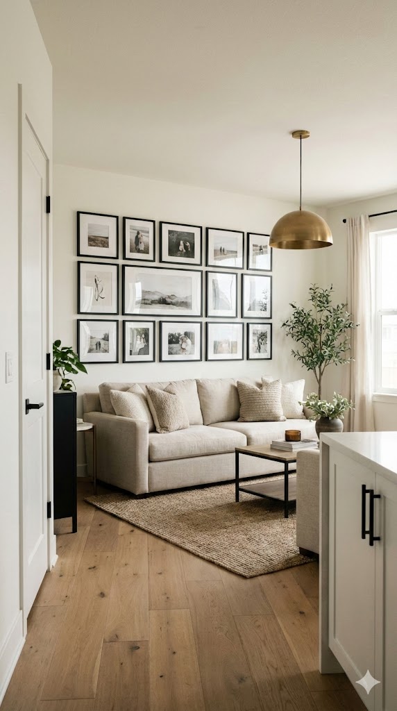
This combo never fails, and it plays nice with light, medium, and dark wood floors. Warm white keeps the room open, black adds structure, and brass brings that little “I hire designers” sparkle (even if you absolutely do not).
Why it works with wood floors
Warm white echoes the wood’s warmth, while black creates crisp edges that keep everything from looking too “country cabin.”
Try this palette:
- Walls: warm white (think ivory, cream, soft alabaster)
- Accents: matte black (frames, hardware, lighting)
- Metals: brass or aged gold
- Textiles: oatmeal linen, wool, or boucle
Want a simple upgrade? Swap bright chrome for brass and watch your medium oak suddenly look intentional.
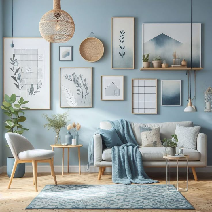
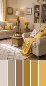
2) Greige + Soft Sage + Natural Linen (The Calm, Clean, “I Sleep 8 Hours” Look)
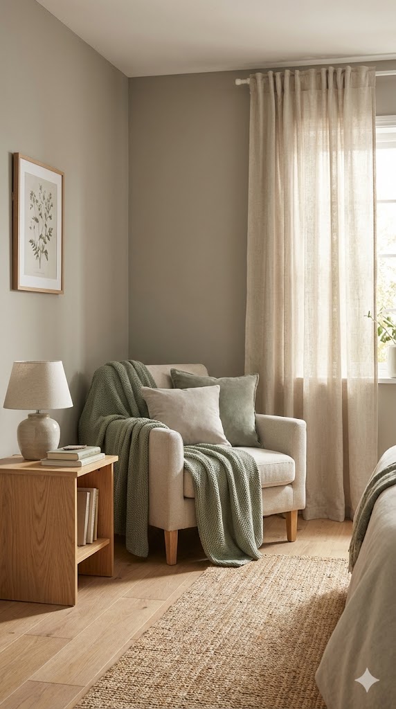
If you want your home to feel relaxing without looking boring, this combo delivers. Greige (gray + beige) keeps things grounded, and sage green adds softness that works especially well with light and medium wood floors.
Best wood floor matches
- Light oak / white oak: sage looks fresh and airy
- Medium oak / hickory: greige calms the warmth without killing it
Try this palette:
- Walls: light greige
- Accent wall or cabinets: soft sage
- Trim: creamy white (not stark)
- Decor: linen, rattan, pale wood accessories
Ever wonder why sage feels so “right” with wood? Nature already did the styling for you.
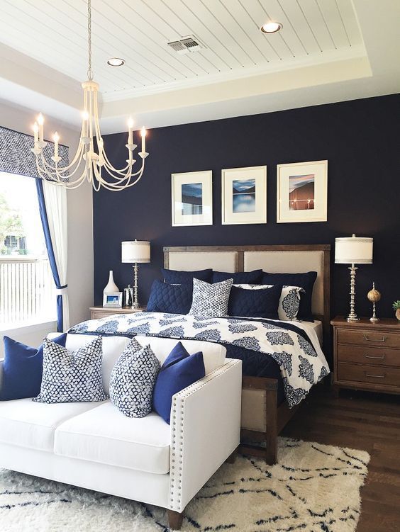
3) Navy Blue + Crisp White + Jute (A Classic That Never Gets Weird)
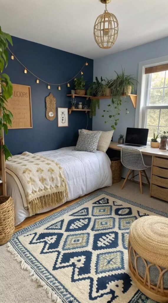
Navy gives you bold contrast without screaming for attention. I love it with light wood floors because the floor brightens the whole look and keeps navy from turning the room into a submarine. Who wants that?
Where to use it
You can go big with navy in a dining room, office, or powder room. If you fear commitment, start with a navy sofa or built-ins.
Try this palette:
- Walls: crisp white (or very pale warm white)
- Anchor pieces: navy (sofa, built-ins, accent wall)
- Warm texture: jute rug, woven baskets, oak accents
- Extra pop: tiny hits of brass or tan leather
IMO, this combo makes even basic builder-grade light oak look “coastal but grown-up.”
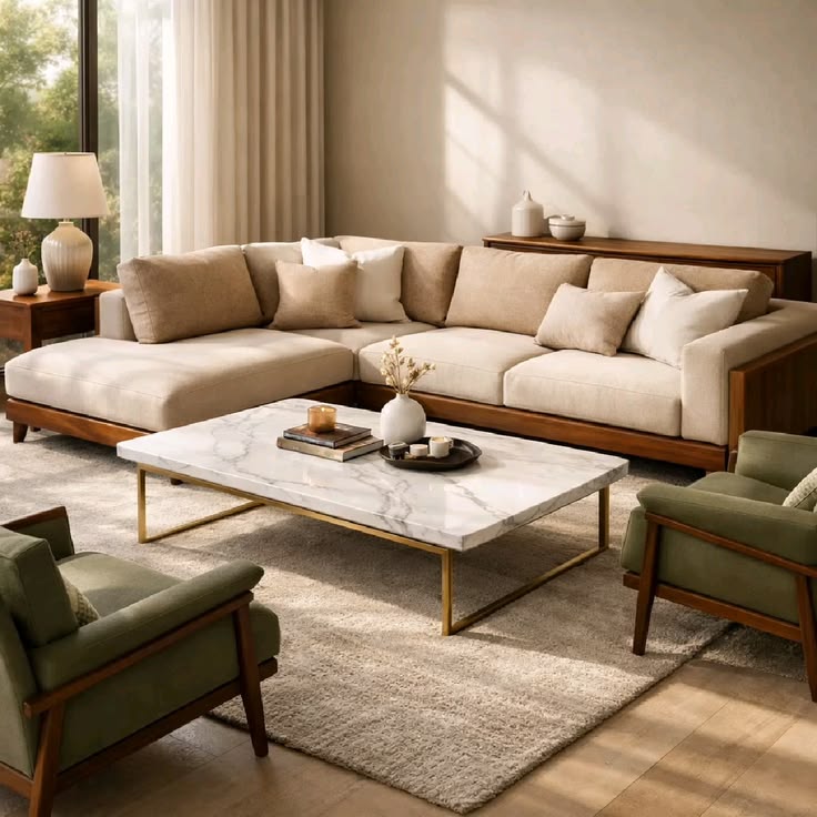
4) Charcoal Gray + Camel + Cream (Moody, But Still Friendly)
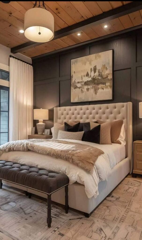
Charcoal brings drama, camel adds warmth, and cream keeps the room breathable. This combo loves medium and dark wood floors, especially floors that already show rich brown tones.
Why it works
Camel and cream echo the warmth in the wood, and charcoal adds contrast without turning cold and icy.
Try this palette:
- Walls: soft charcoal (not pure black)
- Big textiles: cream rug or curtains
- Accents: camel leather, tan pillows, warm wood decor
- Art frames: black or dark bronze
Want to avoid a gloomy vibe? Use lighter cream textiles and add lamps like you mean it.
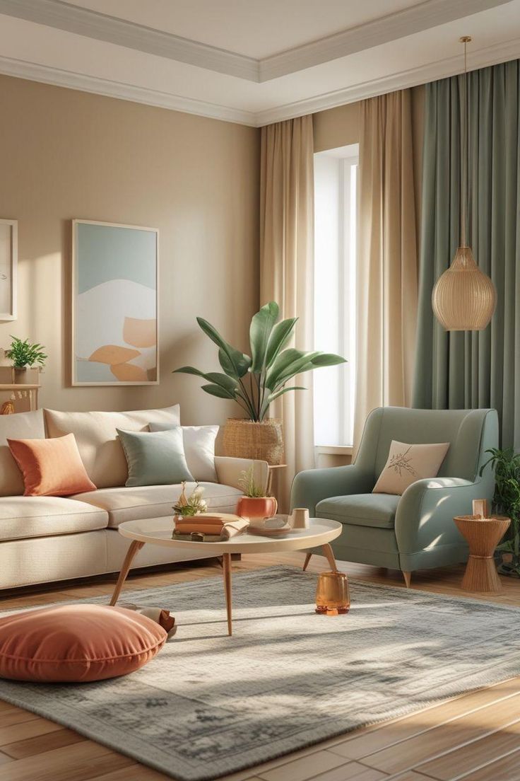
5) Blush + Terracotta + Off-White (Warmth on Warmth, But Make It Chic)
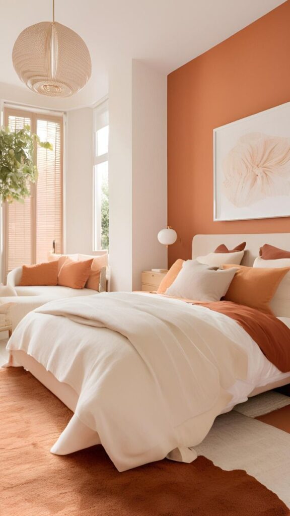
Blush and terracotta sound “trendy,” but they can look timeless when you keep them muted. I love this with light to medium wood floors, especially floors with red or golden undertones.
How you keep it from looking like a makeup aisle
You pick dusty, earthy versions of these colors. Skip anything neon, unless you enjoy visual chaos :/
Try this palette:
- Walls: off-white or soft blush
- Accents: terracotta (pillows, pottery, art)
- Wood-friendly neutrals: warm beige, clay, caramel
- Greenery: olive or eucalyptus tones
Ask yourself this: do you want cozy? Because this combo practically hugs you when you walk in.
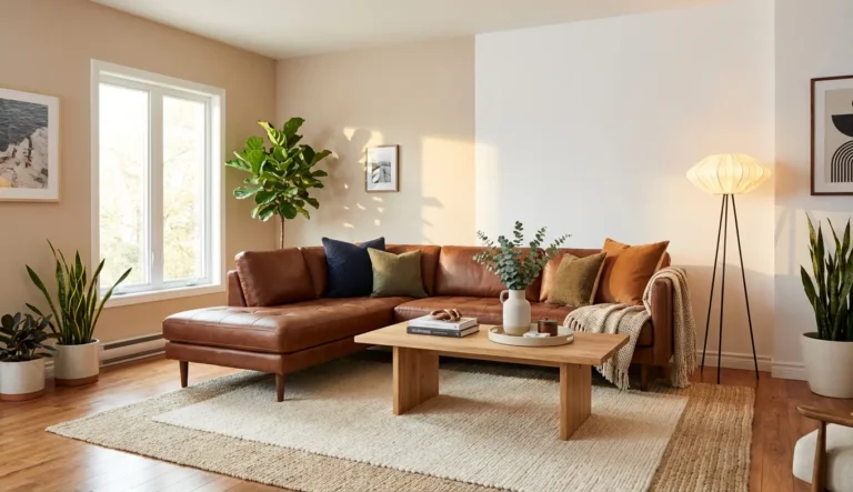
6) Deep Green + Warm White + Cognac Leather (The “Library Energy” Combo)
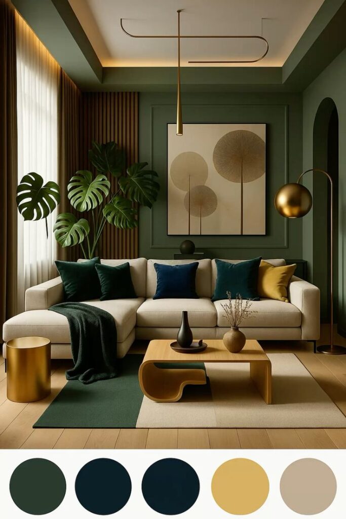
Deep green looks incredible with wood because it shares that grounded, natural vibe. You get a rich, cozy feel that still looks sharp, especially with medium and dark wood floors.
My favorite way to use it
I like deep green on cabinetry, built-ins, or an accent wall, then I let warm white handle the rest. Cognac leather adds instant character, like your house reads books and drinks espresso.
Try this palette:
- Walls: warm white
- Statement color: deep green (forest, hunter, evergreen)
- Furniture: cognac leather chair or sofa
- Metals: brass, antique gold, or black
Ever notice how green makes wood look more “intentional” and less “my floor came with the house”? Yeah, that’s the magic.
7) Slate Blue + Mushroom Taupe + Soft Black (Cool Contrast Without the Cold)
Dark wood floors sometimes push a room into heavy territory. Slate blue and mushroom taupe lift that weight while keeping things sophisticated. This combo works especially well with dark wood floors that lean espresso or walnut.
Why this beats plain gray
Gray can fight warm wood and make everything feel awkward. Mushroom taupe brings warmth, and slate blue adds calm color that still feels adult.
Try this palette:
- Walls: mushroom taupe (a warm, earthy neutral)
- Accents: slate blue (pillows, rugs, art)
- Contrast: soft black (not jet black everywhere)
- Texture: velvet, wool, or woven throws
Want your dark floors to look luxe instead of dated? Give them contrast and softer wall color support.
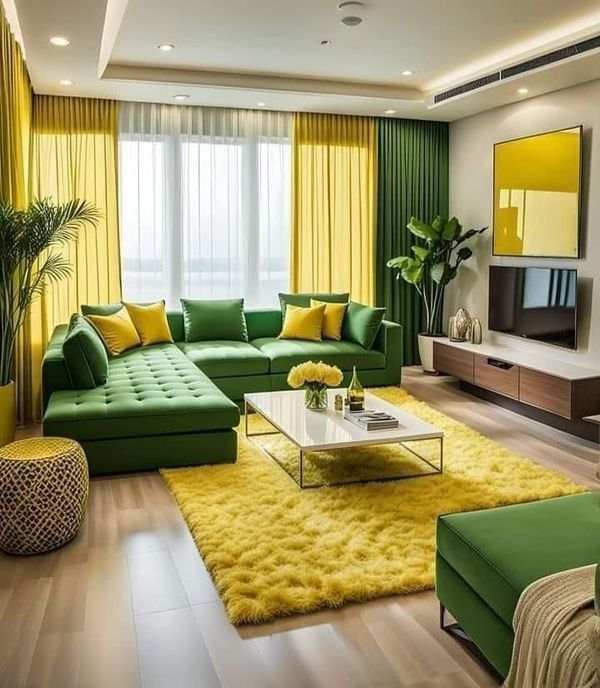
8) Butter Yellow + Ivory + Natural Wood Tones (Sunny Without the Cartoon Vibes)
Yes, yellow. No, not the “elementary school hallway” yellow. Think buttercream, sun-washed, or muted marigold. This combo brightens dark wood floors like nobody’s business and also adds warmth to light wood floors without going bland.
How you keep it classy
You choose a soft yellow and pair it with ivory and natural textures. That’s it. You don’t add rainbow accents and turn your living room into a cereal box.
Try this palette:
- Walls: ivory or soft butter yellow
- Trim: warm white
- Accents: light oak, cane, jute, or flax linen
- Optional contrast: a little black in frames or lighting
Ever walk into a room and instantly feel happier? This combo pulls that trick without trying too hard.
Quick Tips to Make Any Color Combination Work With Wood Floors
You can pick the perfect palette and still feel “meh” if you miss the finishing touches. I use these rules whenever I style a room around wood floors:
- Repeat the wood tone at least twice (a picture frame, a chair leg, a bowl). The room feels cohesive fast.
- Pick one “boss” neutral (warm white, greige, taupe) and let it lead. Too many neutrals start arguing.
- Use contrast on purpose. Light floors love darker anchors, and dark floors love lighter walls.
- Match temperature. Warm floors want warm whites and earthy colors; cooler floors handle cooler whites and blue-grays better.
Do you really need to replace the floor to love the room? Almost never. You just need the right supporting cast.
Final Thoughts: Your Wood Floors Already Did Half the Decorating
You don’t need a design degree or a personality test that tells you you’re “Warm Autumn Whisper” or whatever. You just need a color combo that respects your floor’s undertone and gives the room some contrast.
Here’s the quick recap of the best color combinations for home with wood floors:
- Warm white + black + brass for instant polish
- Greige + sage + linen for calm, airy rooms
- Navy + white + jute for classic contrast
- Charcoal + camel + cream for cozy mood
- Blush + terracotta + off-white for warm modern style
- Deep green + warm white + cognac for rich, timeless vibes
- Slate blue + mushroom taupe + soft black for dark-floor balance
- Butter yellow + ivory + naturals for sunny warmth
Pick one combo, grab a few samples, and test them next to your floor like a sane person. Then enjoy the moment when your room finally stops feeling “almost right” and starts feeling like you meant it all along 🙂