15 Moody Living Room Paint Color Ideas (That Still Feel Cozy)
Your living room can feel cozy and moody. You don’t have to choose between “warm and inviting” and “dramatic and a little mysterious.” Why should your walls live such a limited life?
I fell in love with moody living room paint colors after I painted my own space a deep blue-black and suddenly wanted to read novels like I owned a library ladder. The vibe changed overnight. Ever notice how the right wall color makes your cheap throw blanket look… intentional?
Let’s talk about 15 cozy, moody living room paint color ideas that look rich, stylish, and not like you tried to recreate a haunted house (unless you want that—no judgment).
How to Make Moody Living Room Paint Colors Feel Cozy (Not Cave-y)
Moody paint can look stunning, but you need a few “cozy anchors” so the room still feels welcoming. Do you want drama without doom?
Here’s what always helps me when I go dark:
- Pick warm undertones when your room gets cool light. You’ll avoid that icy, “why does my sofa look sad?” effect.
- Use soft lighting (lamps, sconces, warm bulbs). Overhead-only lighting turns moody into moody in a bad way.
- Add texture like velvet, wool, leather, or chunky knits. Texture makes dark walls feel plush.
- Balance with lighter elements like cream curtains, oak furniture, or a pale rug.
- Test big swatches on multiple walls. FYI: one tiny paint chip lies like it gets paid to do it.
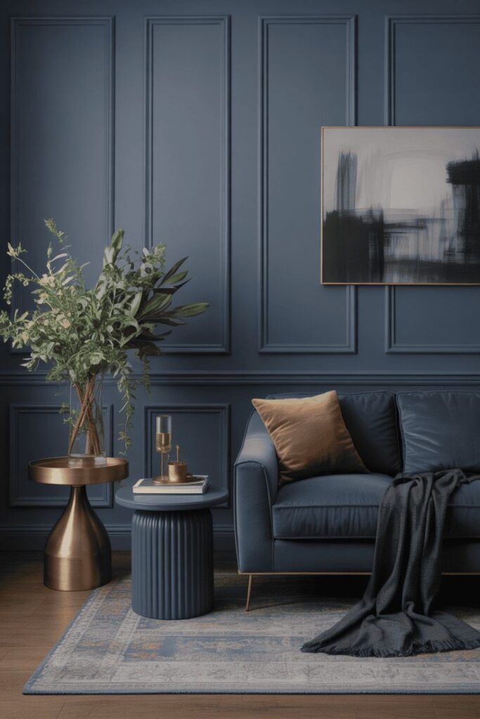
1. Inky Navy (The “Classic But Cooler” Moody Blue)
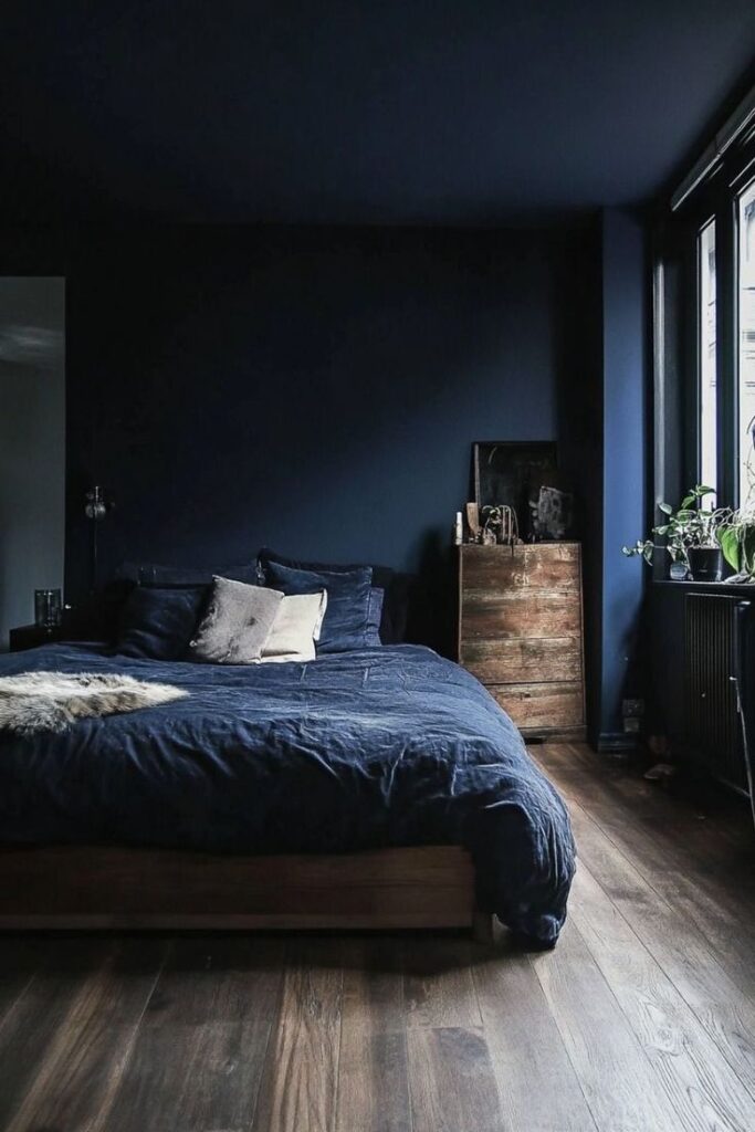
Inky navy gives you that cozy cocoon feeling without going full black. I love it in living rooms because it plays nice with almost every wood tone and still feels elevated. Want a color that looks good at noon and at midnight?
Try it when you want drama that still feels friendly.
- Best with: warm white trim, brass accents, caramel leather
- Lighting tip: use warm bulbs so it doesn’t read too corporate
- Cozy pairing: oatmeal linen curtains + a woven rug
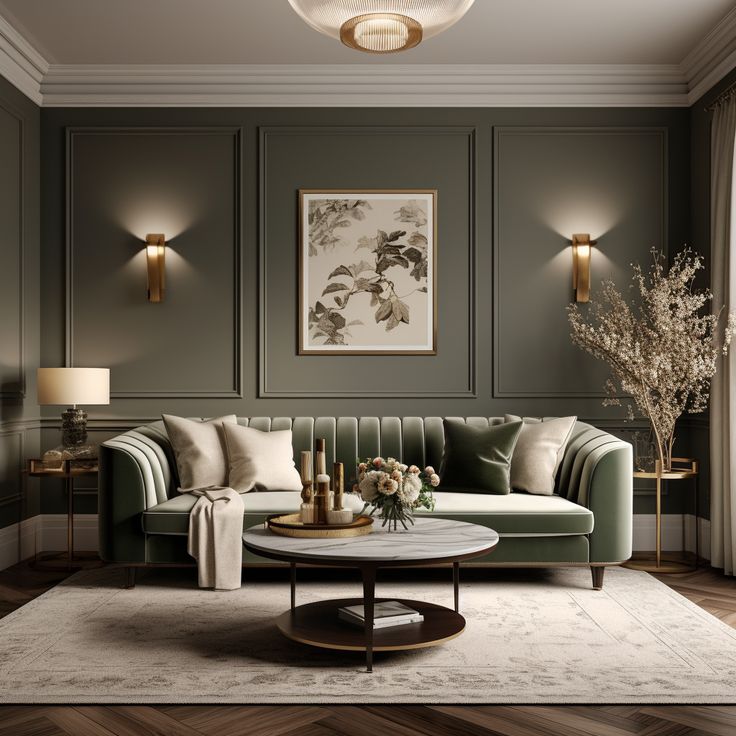
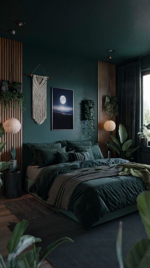
2. Deep Forest Green (Nature, But Make It Sophisticated)
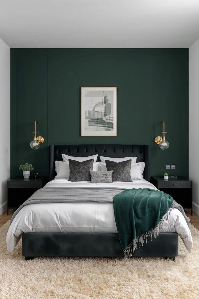
Forest green wraps a room in instant warmth. You get that “cabin in the woods” coziness, minus the actual cabin maintenance. Ever walked into a green room and immediately relaxed?
I reach for this shade when I want moody walls that still feel grounded and calm.
- Best with: walnut, tan leather, warm metals
- Style match: traditional, vintage, modern organic
- Pro move: add art with cream mats to brighten the wall
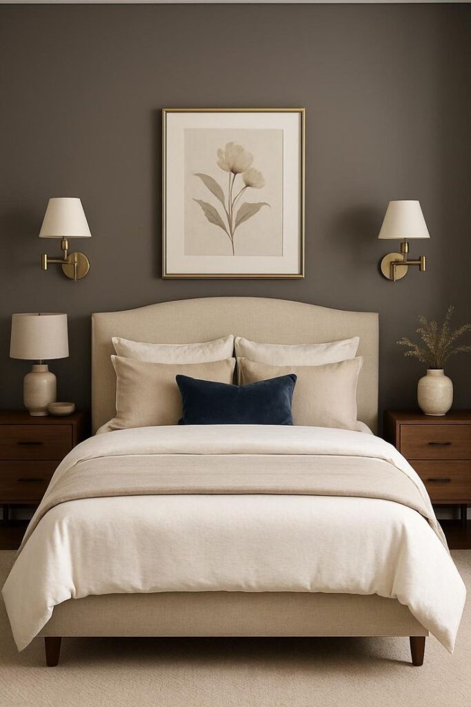
3. Charcoal Gray (The Safe Moody Neutral That Still Looks Expensive)
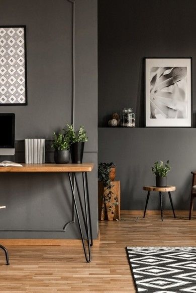
Charcoal delivers mood without shouting. It also gives you a neutral backdrop for colorful art, bold rugs, or that weird sculpture you swear you love. Do you want moody living room walls without committing to a “color-color”?
Charcoal does the job and makes your room look instantly pulled together.
- Best with: crisp white ceilings, black frames, layered lighting
- Undertone check: pick warm charcoal to avoid a cold, steely look
- Finish: eggshell or matte for a soft vibe
4. Smoky Blue-Gray (Soft, Moody, and Weirdly Relaxing)
Smoky blue-gray feels like a rainy-day sweater. It brings mood, but it also keeps the space serene. IMO, this color works magic in living rooms that get a lot of daylight.
If you want moody paint that still feels airy, this one nails it.
- Best with: pale oak, cream upholstery, brushed nickel
- Accent colors: muted rust, clay, faded navy
- Styling tip: add warm-toned pillows to keep it cozy
5. Blackened Teal (Moody With a Hint of “I Travel”)
Blackened teal gives you depth plus personality. It reads green in some light and blue in others, which keeps the room interesting. Ever wanted walls that feel like a fancy cocktail lounge, but you still want to watch cartoons in peace?
This shade brings that vibe.
- Best with: brass, marble, warm woods
- Cozy pairing: terracotta accents + a vintage rug
- Avoid: too many cool grays (they can fight the teal)
6. Chocolate Brown (Yes, Brown—And It Looks Amazing)
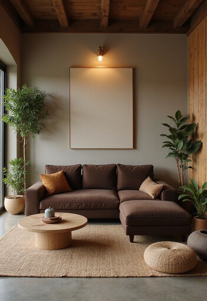
People fear brown because they remember the early 2000s. I get it. Still, a rich chocolate brown looks incredibly cozy and modern when you style it right. Why let beige win forever?
Chocolate brown walls make a living room feel warm, intimate, and seriously grown-up.
- Best with: cream trim, camel leather, natural linen
- Add: lots of texture (bouclé, jute, wool)
- Lighting: warm bulbs or you’ll get “mud” :/
7. Deep Plum (Moody, Cozy, and a Little Dramatic)
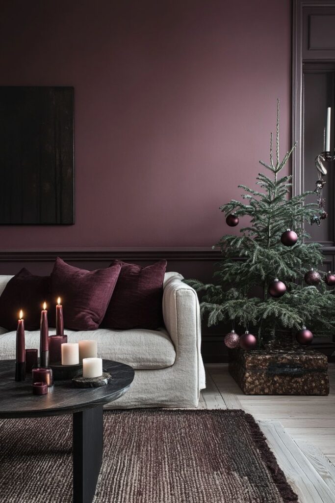
Deep plum feels like a velvet curtain in paint form. It looks luxe, it flatters warm lighting, and it makes art pop. Do you want a color that feels bold but still cozy?
Plum gives you that “statement room” energy without looking loud.
- Best with: antique brass, walnut, soft blush accents
- Great for: eclectic, vintage, maximalist spaces
- Tip: keep the ceiling light to prevent heaviness
8. Wine Red / Oxblood (Warm, Moody, and Seriously Inviting)
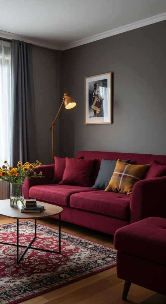
Oxblood brings instant warmth. It also makes a living room feel like a place where people actually sit and talk instead of politely perching. Ever notice how red-based moody colors make everything feel more intimate?
Use it when you want cozy drama that doesn’t feel trendy in a flimsy way.
- Best with: cream textiles, dark wood, aged brass
- Add: a patterned rug to soften the intensity
- Use sparingly: on all walls or as an accent wall
9. Dark Olive (Earthy Mood Without the Gloom)
Dark olive looks subtle, earthy, and expensive. It also plays well with vintage decor and natural materials. Want moody living room paint that feels calm instead of intense?
Olive keeps things grounded and warm.
- Best with: warm whites, cognac leather, woven textures
- Accent colors: ochre, black, dusty pink
- Tip: choose an olive with brown undertones for maximum coziness
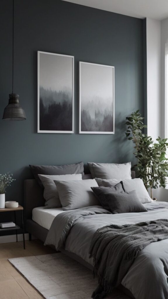
10. Slate Blue (A Moody Blue That Still Feels Soft)
Slate blue gives you a stormy look without feeling harsh. I like it for living rooms where you want a relaxed vibe but still crave depth. Do you want your room to feel peaceful but not boring?
Slate blue checks that box.
- Best with: light oak, ivory upholstery, matte black accents
- Lighting: works well in both north- and south-facing rooms
- Style match: coastal-modern, transitional, Scandinavian-ish
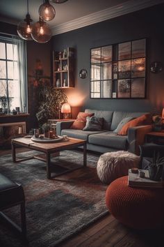
11. Warm Black (The Bold Move That Looks Shockingly Cozy)
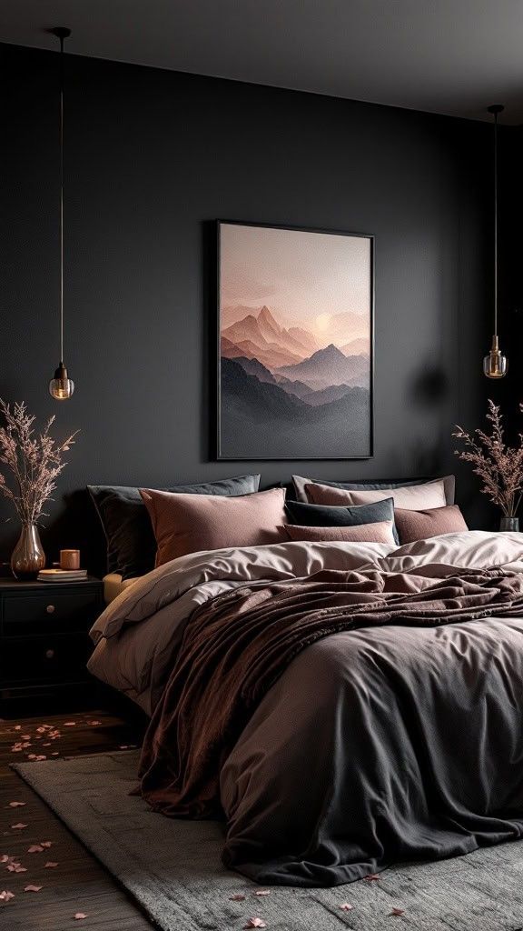
Warm black walls sound terrifying until you try them. Then you realize black can feel like a warm hug when you pick the right undertone and layer lighting. Ever seen a black living room that feels like a chic boutique hotel?
You can create that vibe at home, no lobby music required.
- Best with: warm white trim, amber lighting, natural wood
- Must-have: multiple lamps (table + floor + sconce if you can)
- Pro tip: add a big, light-toned rug to balance the depth
12. Taupe-Charcoal (The “I Want Mood But I Also Fear Commitment” Color)
Taupe-charcoal gives you the best of both worlds: moody depth plus warmth. It feels softer than straight gray and more modern than traditional taupe. Do you want a safe moody living room paint color that still feels designer?
This one delivers quietly, like the friend who always shows up with snacks.
- Best with: beige, cream, warm metals, oak
- Undertone: look for brown warmth so it stays cozy
- Finish: matte for that velvety, modern look
13. Midnight Blue (Darker Than Navy, Still Totally Livable)
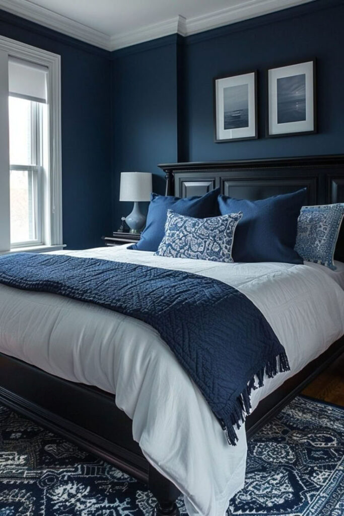
Midnight blue looks almost black in the evening and rich blue during the day. I love it for creating that cozy “evening lounge” feel in a living room. Want a color that makes movie night feel extra legit? 🙂
Midnight blue makes the TV area feel intentional and snug.
- Best with: brass, cream upholstery, dark woods
- Add: lighter art and textiles to create contrast
- Works great: on built-ins or a fireplace wall
14. Moody Greige (The Undercover Cozy Color)
Greige can feel boring, but a deeper moody greige looks refined and cozy. It gives you warmth, and it lets your furniture do the talking. Do you want moody walls that won’t clash with your existing decor?
Moody greige works like a charm, especially in open-concept spaces.
- Best with: black accents, warm white trim, natural textures
- Great for: renters-turned-homeowners who need flexibility
- Tip: pick a shade that leans warm, not purple-gray
15. Burnt Sienna / Clay (Moody, Warm, and Seriously Trending for a Reason)
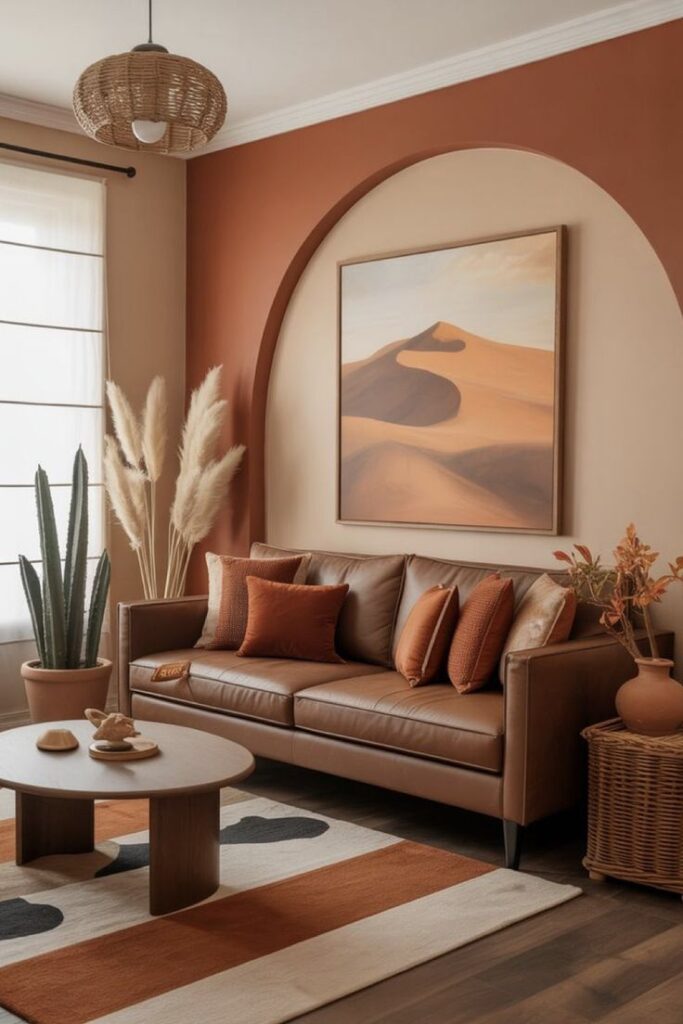
Burnt sienna and deep clay tones bring mood through warmth instead of darkness. You get a cozy, earthy look that feels welcoming and current. Ever want moody living room paint that still glows at golden hour?
Clay tones make your room feel alive and comforting.
- Best with: cream, tan, olive, aged brass
- Style match: desert modern, boho, Mediterranean-inspired
- Easy win: pair with lots of plants and warm wood
Quick Cheat Sheet: Picking the Right Moody Color for Your Room
You can save yourself a repaint (and a minor identity crisis) if you match color to conditions. Ask yourself: how much light do you really get?
- You get low natural light → choose warm charcoal, deep olive, taupe-charcoal
- You get tons of daylight → try midnight blue, forest green, warm black
- You want cozy warmth fast → pick oxblood, chocolate brown, burnt sienna
- You fear bold color regret → go with smoky blue-gray or moody greige
Conclusion: Go Moody, Keep It Cozy, and Trust Your Gut
You can absolutely pull off a moody living room paint color and keep the space cozy. You just need the right undertones, warm lighting, and a few soft textures to balance the depth. Why settle for bland walls when you can create a room that feels like a vibe?
Pick one shade from this list, grab a sample, and slap it on the wall like you mean it. Your future self will thank you—probably while lounging under a blanket, acting like the room always looked this good.