10 Color Schemes for the Home That Flow Room-to-Room
Ever walk from your living room into the hallway and think, “Wait… why does it feel like I switched TV channels?” Yeah. That “random room color” life sounds fun until your house starts looking like a paint aisle exploded.
I learned this the hard way after I painted my dining room a bold color that I swore looked classy… and then I watched it bully every other room in the house. So if you want color schemes for the home that flow room-to-room, you and I share the same goal: a place that feels connected without feeling boring. 🙂
How to Make a Whole-House Color Palette Flow (Without Losing Your Mind)
You don’t need every wall to match. You need a repeatable system—kind of like an outfit. You wouldn’t wear neon shoes, a plaid shirt, and a tuxedo jacket all at once… unless you enjoy confusion.
Pick a “Hero Neutral” and Stick With It
Choose one main neutral that shows up everywhere in some form (walls, trim, rugs, or big furniture). That neutral acts like the bass line in a song. You don’t notice it until it disappears.
Good hero neutrals include:
- Warm white (creamy, not icy)
- Greige (a gray-beige that plays nice with others)
- Soft taupe
- Gentle light gray (with a consistent undertone)
Repeat 2–3 Accent Colors Like a Pro
Want that “designer” look? Repeat accents across rooms. I don’t mean copy-paste the same pillows everywhere (please don’t). I mean you echo colors in different ways.
Try this:
- Use the same accent color in small hits: art, a throw, a vase, a lampshade
- Repeat the same metal finish (or two max)
- Keep undertones consistent (warm with warm, cool with cool)
FYI, undertones matter more than the color name. “White” can look pink, yellow, gray, or blue depending on the light. Ever bought paint and then watched it turn weird at night? Exactly.
Use Transitions Like Hallways and Rugs to “Bridge” Rooms
You can create room-to-room flow with:
- Runner rugs that include both room colors
- Artwork that mixes palettes
- Plants and wood tones that act like neutral “glue”
Now, let’s get to the fun part—the actual whole-house color ideas.
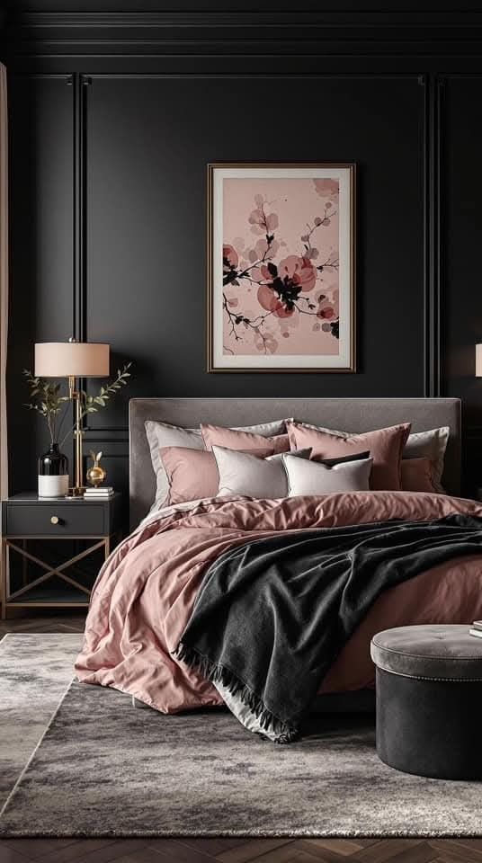
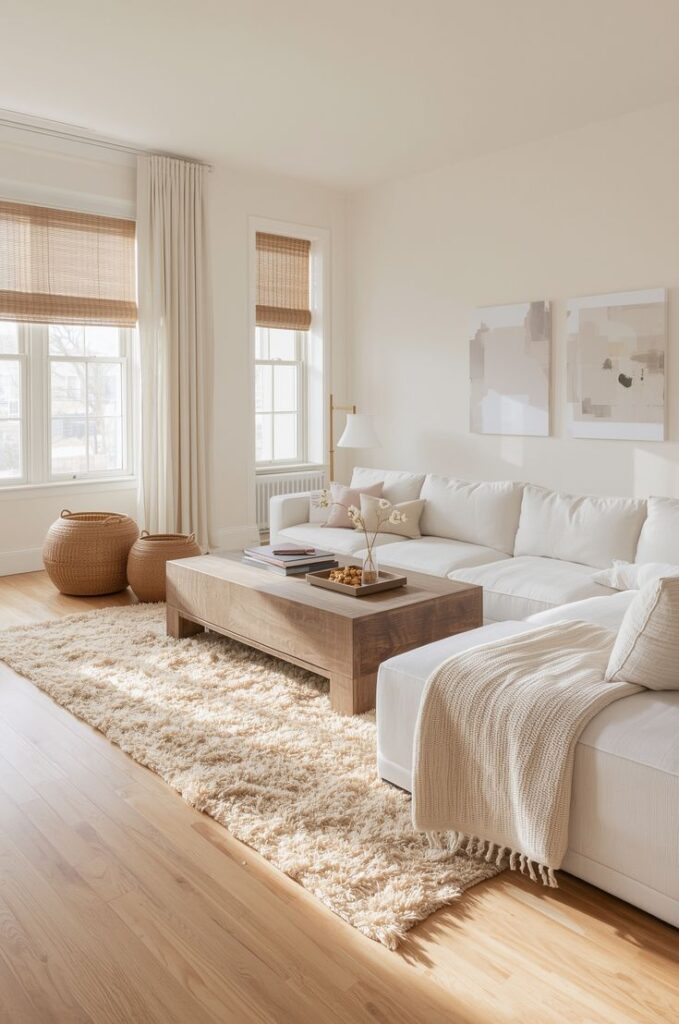
1) Warm White + Soft Black + Natural Wood (The “Goes With Everything” Scheme)
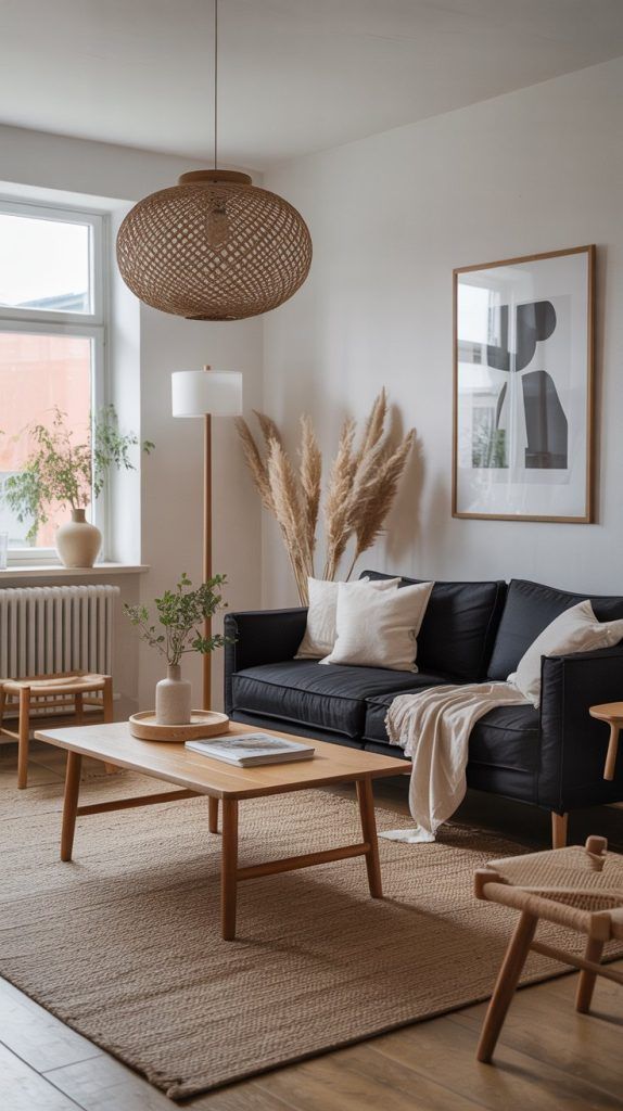
This combo makes your home feel clean, cozy, and pulled together. You get contrast without harshness, and you can swap decor seasonally without repainting every time you get bored.
Try this palette:
- Walls: warm white
- Accents: soft black (not jet black)
- Materials: oak, walnut, rattan, linen
Flow tip: Repeat black details in every room—hardware, frames, a lamp base—so your eye connects the spaces naturally. Ever notice how black window frames make everything look intentional? Same idea.
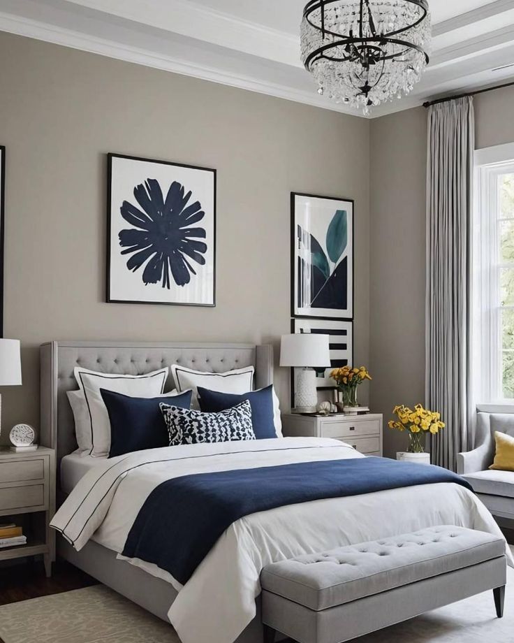
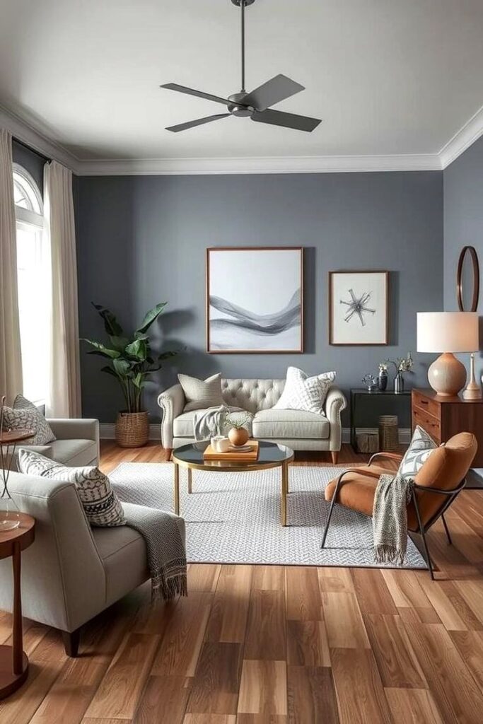
2) Greige + Crisp White + Muted Navy (Polished but Relaxed)
IMO, this one works like magic if you want calm rooms that still feel “done.” Navy adds depth without screaming for attention, and greige keeps everything smooth room-to-room.
Use it like this:
- Walls: greige
- Trim: crisp white
- Accent color: muted navy
Best rooms for navy: offices, dining rooms, powder rooms, and bedroom textiles. Keep navy as an accent in open layouts so it doesn’t overpower the shared space.
3) Cream + Sage Green + Warm Brass (Instant Cozy, Zero Effort)
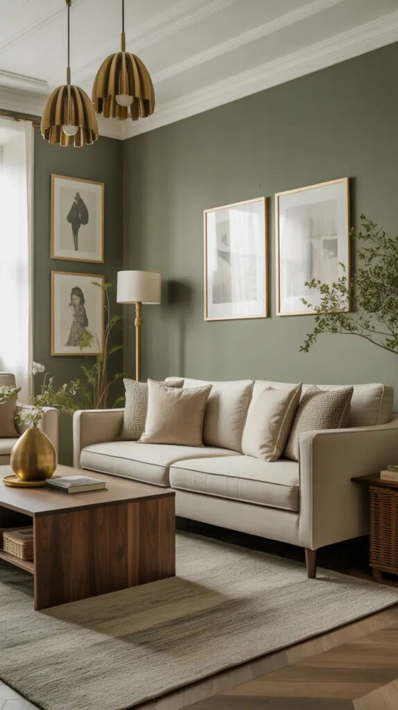
Sage brings life, cream keeps things soft, and brass adds that “I have taste” sparkle. You get a cozy vibe that still looks fresh.
Go for:
- Walls: creamy off-white
- Accent: sage green
- Metals: warm brass
Flow tip: Use sage in different intensities. Put pale sage in a bedroom and deeper sage on kitchen cabinets or a mudroom bench. You create variety while keeping the same color story.
4) Light Taupe + Terracotta + Olive (Earthy Without Feeling Like a Desert)
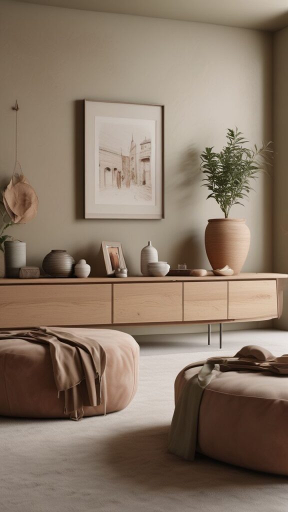
Terracotta warms up a home fast. Olive keeps it grounded. Taupe stops everything from looking like a spicy clay pot collection.
Try:
- Walls: light taupe
- Accent: terracotta (pillows, art, a painted vanity)
- Secondary accent: olive (plants help a lot here)
I used terracotta in my entryway once, and guests immediately acted like I suddenly knew what I was doing. Do you want a compliment-generator color? This one delivers.
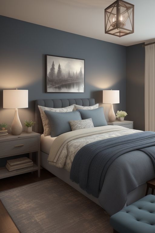
5) Soft Gray + Dusty Blue + White Oak (Calm, Airy, Not Cold)
Gray gets a bad reputation because people pick the wrong gray. Pick a soft gray with the right undertone, and dusty blue will make it feel breezy instead of blah.
Use:
- Walls: soft gray (choose warm or neutral undertones)
- Accent: dusty blue
- Wood tone: white oak or light ash
Flow tip: Put dusty blue in fabrics across rooms—curtains in one, bedding in another, a kitchen runner somewhere else. That repetition creates room-to-room cohesion without matching sets.
6) Beige + Blush + Charcoal (Soft and Sophisticated, Not Sugary)
Blush doesn’t need to look like a kid’s room. Pair it with charcoal, and you get a grown-up, modern vibe. Beige keeps everything warm and welcoming.
Palette plan:
- Walls: beige (warm, not yellow)
- Accent: blush (think “dusty rose,” not bubblegum)
- Contrast: charcoal
Flow tip: Use charcoal in “hard” elements—light fixtures, curtain rods, picture frames. Then use blush in “soft” elements—pillows, art, throws. You balance it like a pro.
7) White + High-Contrast Green + Black (Fresh, Bold, and Clean)
This scheme gives you that crisp, modern feel with a punch of personality. Green energizes a space, and black frames it all nicely.
Go with:
- Walls: clean white (not too stark)
- Accent: deep green (emerald, forest, or hunter)
- Details: black
Best use: Paint one built-in, a kitchen island, or a bathroom vanity green. Then repeat that green in small doses throughout the house. Want an easy “flow” trick? Match green plants to your green accents and let nature do the work.
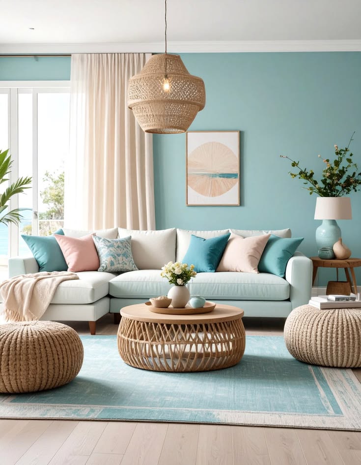
8) Sand + Seafoam + Driftwood (Beachy Without the Seashell Trauma)
You can do coastal without turning your home into a souvenir shop. Skip the “live laugh nautical” stuff and focus on soft, sun-washed colors.
Try:
- Walls: sandy beige or warm off-white
- Accent: seafoam or pale aqua
- Wood: driftwood tones, light oak, woven textures
Flow tip: Keep seafoam mostly in textiles and decor. If you paint too many walls aqua, the house starts to feel themed. Do you want relaxed coastal… or accidental hotel lobby?
9) Mushroom + Lavender-Gray + Antique Gold (Quietly Interesting)
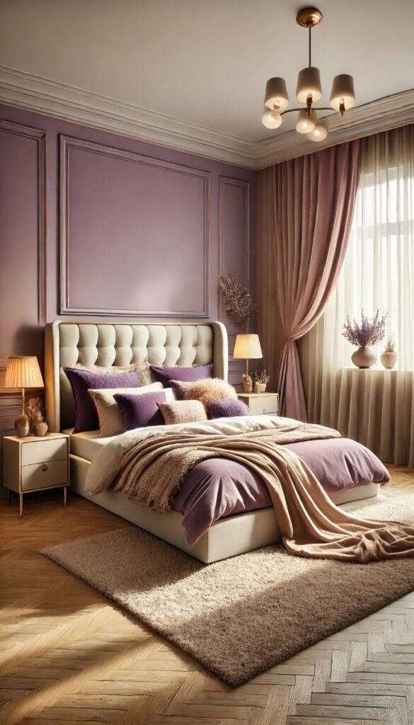
This one surprises people in the best way. Mushroom acts like a sophisticated neutral, lavender-gray adds softness, and antique gold brings warmth without shininess.
Use:
- Walls: mushroom (a taupe-gray hybrid)
- Accent: lavender-gray (very muted)
- Metals: antique gold
Flow tip: Put lavender-gray in low-commitment areas—bedrooms, art, rugs—then echo antique gold in frames and lighting. You get a cohesive color scheme that feels custom.
10) Warm White + Honey Wood + Cinnamon (Warmth That Still Feels Bright)
If your home feels a little flat, this scheme fixes it fast. Honey wood adds glow, cinnamon adds spice, and warm white keeps everything open and airy.
Try:
- Walls: warm white
- Wood: honey oak, maple, or warm walnut
- Accent: cinnamon (rusty red-brown)
Flow tip: Use cinnamon in small, repeatable hits:
- a clay vase in the living room
- a patterned pillow in the family room
- a kitchen towel or runner
That repetition makes your whole house color palette feel intentional without going full “matching set.”
Final Thoughts: Pick a Palette, Repeat It, Enjoy Your Life
You don’t need perfect rules. You need a home color scheme that repeats key tones, keeps undertones consistent, and creates tiny visual “echoes” from room to room. That’s how you get that effortless flow.
So which direction fits you right now—calm and airy, warm and earthy, or crisp and modern? Grab a few paint chips, test them in real light, and commit like you mean it. Your future self will thank you… and your hallway will finally stop fighting your living room.