8 Neutral Whole-House Paint Palettes: Walls, Trim, Doors & Ceilings
You want a neutral whole-house paint palette that looks pulled-together… without turning your place into a sad beige box, right? I get it. I’ve repainted “just one room” before and somehow ended up standing in the hallway at 10 p.m. whispering, “Now the trim looks weird,” like a person in a paint-themed thriller.
Neutrals feel “safe” until you pick the wrong one and your living room starts giving off pinky-bandage vibes :/ So let’s make this easy. Below, I’m sharing 8 neutral whole-house paint palettes that cover walls, trim, doors, and ceilings, plus the little choices that make everything feel intentional.
How I Pick a Whole-House Neutral Palette (So It Actually Flows)
If you want your house to feel cohesive, you need more than a random gallon of “Greige Whisp” you grabbed under fluorescent lights.
Here’s what I watch for every time:
- Undertone first, color second. Warm (yellow/red), cool (blue/green), or balanced.
- Consistency across spaces. I keep one main wall neutral, then I rotate accents and door colors.
- Trim and ceiling strategy. I pick one white for trim/ceilings to avoid a Frankenhouse effect.
- Door color = quiet drama. Doors and built-ins can add depth without screaming “look at me!”
FYI: I always test swatches on two walls and check them in morning + evening light. Why trust a paint chip that never saw your lamp situation?
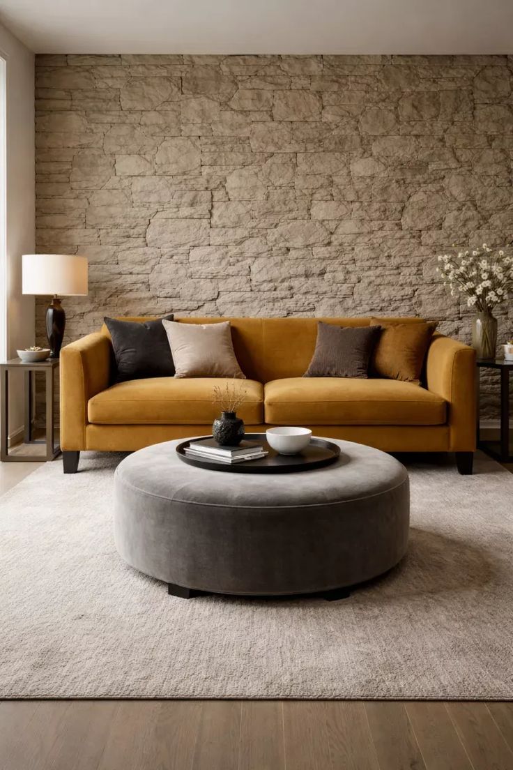
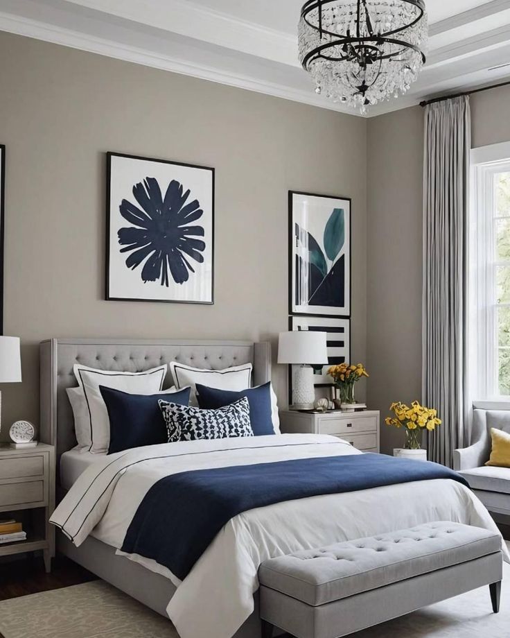
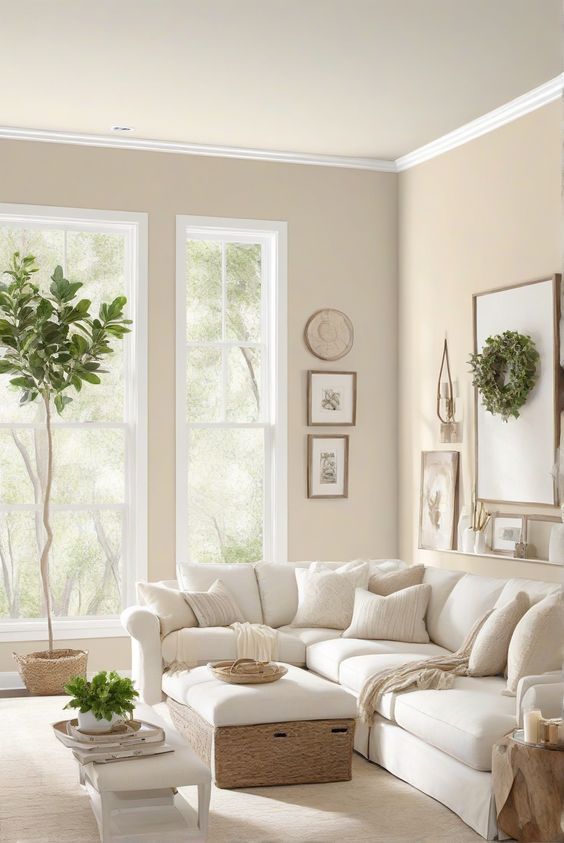
Palette 1: Warm White + Soft Greige + Deep Bronze (Cozy, Not Yellow)
This combo gives you that “clean but comfy” look—like your house drinks lattes but still owns a vacuum. I’ve used this vibe in open floor plans where you can see five rooms at once, and it keeps everything calm without going flat.
Warm whites can look creamy (in a good way), and the bronze on doors adds grown-up contrast. Ever notice how doors look more “designed” when they don’t match the trim? Yeah, that’s not an accident.
Whole-house paint colors (walls/trim/doors/ceilings):
- Walls: Sherwin-Williams Alabaster (SW 7008)
- Trim: Sherwin-Williams Pure White (SW 7005)
- Doors: Sherwin-Williams Urbane Bronze (SW 7048)
- Ceilings: Sherwin-Williams Alabaster (SW 7008) at 50–75% strength or Pure White
Quick tip: Use satin on doors and semi-gloss on trim for wipeability without that plastic shine.
Palette 2: The “Perfect Greige” Set (Neutral That Actually Behaves)
If you want one palette that works in almost any home style, this one shows up and does its job. Greige gives you warmth and structure, so you avoid icy gray sadness and avoid buttercream overload.
I like this palette when homeowners tell me, “I want neutral… but I also want it to look like I tried.” You’ll get depth, but you won’t get drama.
Whole-house paint colors (walls/trim/doors/ceilings):
- Walls: Benjamin Moore Edgecomb Gray (HC-173)
- Trim: Benjamin Moore Chantilly Lace (OC-65)
- Doors: Benjamin Moore Kendall Charcoal (HC-166)
- Ceilings: Benjamin Moore Chantilly Lace (OC-65)
Why it works: Edgecomb Gray leans warm, so it plays nicely with wood floors and brass hardware. Want an easy refresh later? Swap rugs and art, and the paint still looks right.
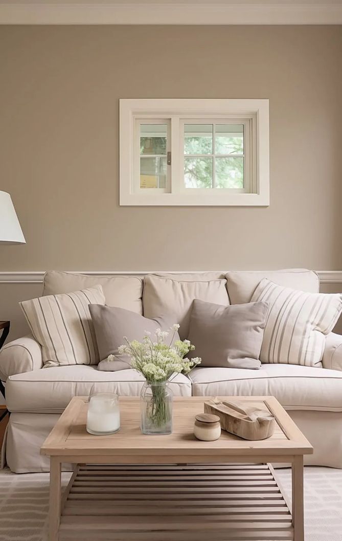
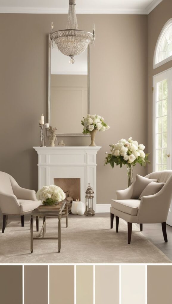
Palette 3: Soft Taupe + Creamy White (Warm, Airy, Expensive-Looking)
This one nails that “light and elevated” feeling without going stark. I like it in houses with lots of texture—think oak floors, woven shades, linen sofas, the whole Pinterest therapy package.
Taupe brings gentle warmth, and creamy trim keeps things soft. Do you want your rooms to feel welcoming the second someone walks in? This palette does that.
Whole-house paint colors (walls/trim/doors/ceilings):
- Walls: Benjamin Moore Pale Oak (OC-20)
- Trim: Benjamin Moore White Dove (OC-17)
- Doors: Benjamin Moore Chelsea Gray (HC-168)
- Ceilings: Benjamin Moore White Dove (OC-17) (flat)
My take: White Dove saves you from the “blinding trim” look while still reading crisp.
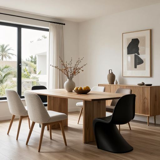
Palette 4: Clean Off-White + Cool Light Gray (Bright Without Feeling Sterile)
You want a brighter, cleaner look, but you don’t want your house to feel like a dentist office. Fair. This palette keeps things fresh while still feeling like humans live there.
I’ve used this setup in homes with lots of north-facing light, where warm paints can turn oddly beige. Cool-leaning neutrals can behave better there—who knew lighting could feel so personal?
Whole-house paint colors (walls/trim/doors/ceilings):
- Walls: Benjamin Moore Classic Gray (OC-23)
- Trim: Benjamin Moore Chantilly Lace (OC-65)
- Doors: Sherwin-Williams Peppercorn (SW 7674)
- Ceilings: Benjamin Moore Chantilly Lace (OC-65)
Keep it grounded: Add warm wood or tan textiles so the cool palette still feels inviting.
Palette 5: Mushroom Greige + Soft White (The “I Have Taste” Neutral)
This palette gives you that subtle, earthy designer tone—like greige, but with more personality. “Mushroom” neutrals work magic in older homes and transitional spaces because they blend with stone, brick, and mixed metals.
IMO, this palette flatters imperfect walls better than bright whites. It also makes art look intentional, even if you hung it five minutes before guests arrived.
Whole-house paint colors (walls/trim/doors/ceilings):
- Walls: Sherwin-Williams Accessible Beige (SW 7036)
- Trim: Sherwin-Williams Greek Villa (SW 7551)
- Doors: Sherwin-Williams Dovetail (SW 7018)
- Ceilings: Sherwin-Williams Greek Villa (SW 7551) (flat)
Best for: Homes with warm floors, creamy cabinets, or lots of natural textures.
Palette 6: Soft Sand + Warm White (Beachy Without the Seashell Decor)
You can absolutely get that airy, coastal calm without putting a “Relax” sign in the bathroom. This palette leans warm and sandy, and it keeps everything bright without turning your walls yellow.
I love it for open kitchens and family rooms because it plays nicely with white cabinets, rattan, and light oak. Ever wonder why some “light” colors still feel cozy? Warm undertones do the heavy lifting.
Whole-house paint colors (walls/trim/doors/ceilings):
- Walls: Sherwin-Williams Shoji White (SW 7042)
- Trim: Sherwin-Williams Alabaster (SW 7008)
- Doors: Sherwin-Williams Balanced Beige (SW 7037)
- Ceilings: Sherwin-Williams Alabaster (SW 7008) (flat)
Palette 7: Light Greige + Soft White + Near-Black Doors (Crisp, Modern, Still Neutral)
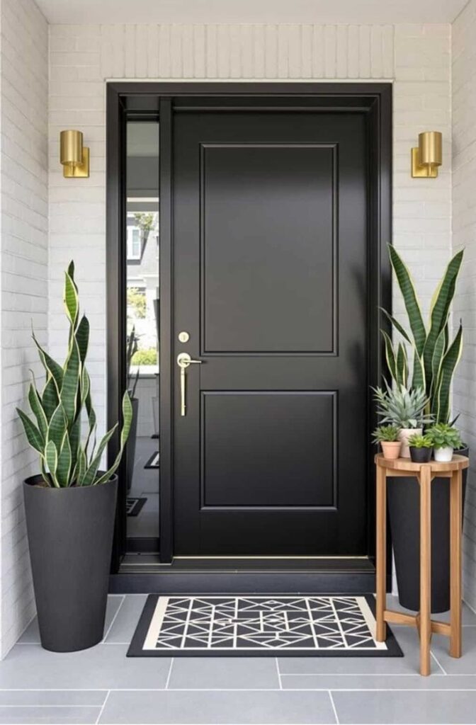
If you want a palette that feels tailored, this one does it. Light greige walls keep things calm, while near-black doors add structure and a little swagger. And yes, doors count as part of your whole-house paint palette—those slabs take up a lot of visual space.
I’ve used this in homes where people wanted “modern” but still wanted warmth. The dark doors make basic builder trim look more custom. Who doesn’t love a cheat code?
Whole-house paint colors (walls/trim/doors/ceilings):
- Walls: Benjamin Moore Balboa Mist (OC-27)
- Trim: Benjamin Moore White Dove (OC-17)
- Doors: Benjamin Moore Wrought Iron (2124-10)
- Ceilings: Benjamin Moore White Dove (OC-17) (flat)
Pro move: Match door hardware finishes throughout the house so the dark doors feel intentional.
Palette 8: Warm Putty + Creamy White (Soft, Earthy, Super Livable)
This palette feels relaxed and real. It works when you want warmth but you hate anything that reads “yellow.” Warm putty tones also help open concept spaces feel connected without looking like one giant beige blob.
I like this palette for homes with mixed materials—like white kitchens, wood furniture, and some black accents. Want a neutral that hides scuffs and fingerprints better than bright white? This one shows up for you 🙂
Whole-house paint colors (walls/trim/doors/ceilings):
- Walls: Sherwin-Williams Natural Linen (SW 9109)
- Trim: Sherwin-Williams Creamy (SW 7012)
- Doors: Sherwin-Williams Gauntlet Gray (SW 7019)
- Ceilings: Sherwin-Williams Creamy (SW 7012) (flat)
Watch the light: Natural Linen looks warmer at night, so test it near lamps you actually use.
Quick “Make It Look Pro” Tips (Without Losing Your Weekend)
You can pick the best neutral paint colors in the world and still end up annoyed if you skip the boring details. I’ve learned this the hard way, usually while staring at a patchy ceiling at midnight.
Here’s what helps the most:
- Use flat on ceilings. You’ll hide seams and roller marks way better.
- Keep trim consistent. Pick one trim white for the entire house.
- Choose door color on purpose. Go 1–2 shades darker than walls for subtle depth, or go near-black for contrast.
- Stick to a sheen plan:
- Walls: eggshell or matte (I like matte in living spaces)
- Trim: semi-gloss
- Doors: satin or semi-gloss
- Ceilings: flat
Do you want your paint job to look custom? Consistency does more than “fancy” colors ever will.
Final Thoughts: Pick One Lane, Then Commit
You don’t need 47 paint samples and a crystal ball. You need a neutral whole-house paint palette that matches your home’s light and your fixed finishes, then you need to repeat it like a grown-up. Each of the palettes above gives you a clear plan for walls, trim, doors, and ceilings, so you can stop second-guessing every doorway.
![[15 Unique DIY Bird Bath Ideas & How to Make Bird Bath]](https://evyvehomedecor.com/wp-content/uploads/2026/05/Unique-DIY-Bird-Bath-Ideas-3.jpg)