13 Interior Paint Colors to Try If You’re Over Gray (Fresh Alternatives)
If your walls look like a never-ending slideshow of “Agreeable Gray” lookalikes, I get it. Gray had a moment… and then it moved in, unpacked, and started eating all your snacks. So if you feel ready for fresh alternatives to gray that still look polished (not like a kid’s art project), you’re in the right place.
I swapped gray out in my own place after I realized every photo looked like a moody weather forecast. The good news? You can keep that calm, grown-up vibe without living inside a concrete box. FYI :), a lot of the best interior paint colors right now lean warmer, earthier, and more “human.”
So… what do you paint when you’re over gray but still want your home to feel pulled together?
1) Creamy Off-White (Not Stark, Not Yellow, Just Cozy)
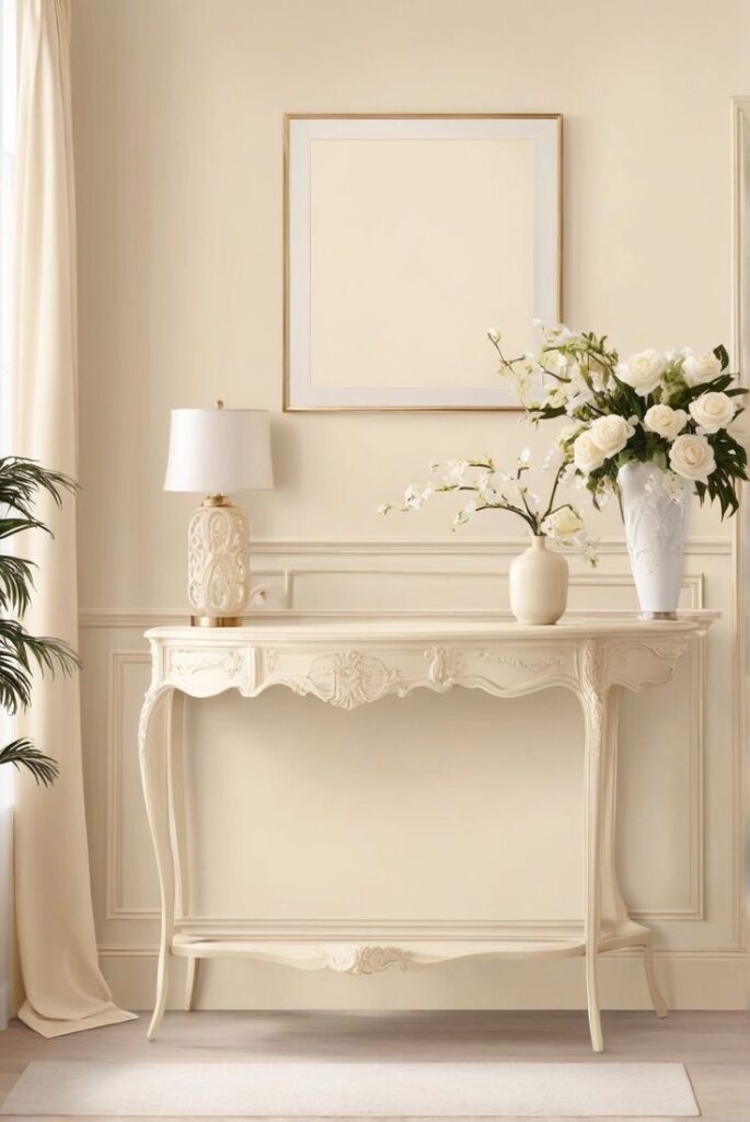
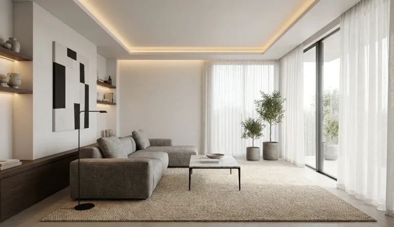
Creamy off-white gives you that clean backdrop without the icy, sterile vibe. You keep brightness, but you also get warmth—aka your room stops feeling like it waits for a lab technician. I love this color when I want my art and furniture to do the talking.
Creamy off-white also plays nicely with almost every wood tone. Ever noticed how gray fights warm oak like they hold a grudge?
- Best for: living rooms, open layouts, hallways
- Pairs well with: warm woods, black accents, natural linen
- Finish tip: choose eggshell for walls, semi-gloss for trim
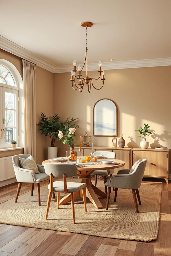
2) Soft Beige (Yes, Beige—And It Looks Expensive Now)
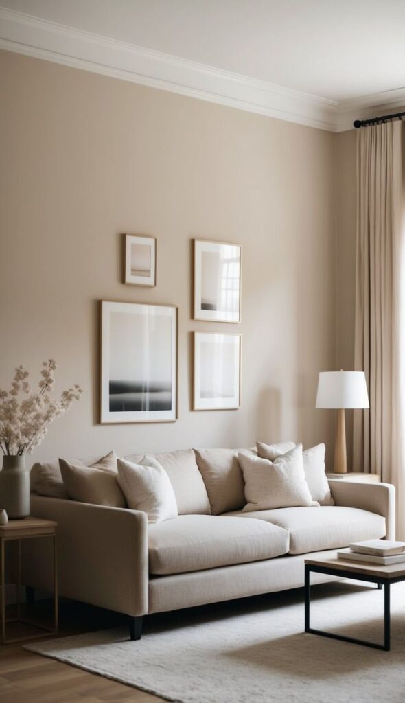
Beige came back with better styling and a little more self-respect. A soft beige reads warm, calm, and intentionally neutral, which helps you replace gray without swinging into “banana pudding” territory. I use beige when I want a space to feel inviting but still minimalist.
You also get a bonus: beige makes skin tones look better. Who knew paint could do more for you than your overhead lighting?
- Best for: bedrooms, family rooms, cozy dens
- Look for: pink or peach undertones for warmth
- Avoid: super yellow beiges unless you love that :/
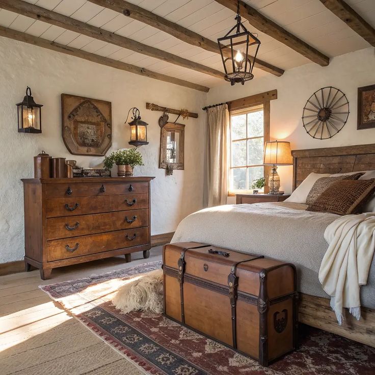
3) Mushroom Taupe (The Neutral That Actually Feels Modern)
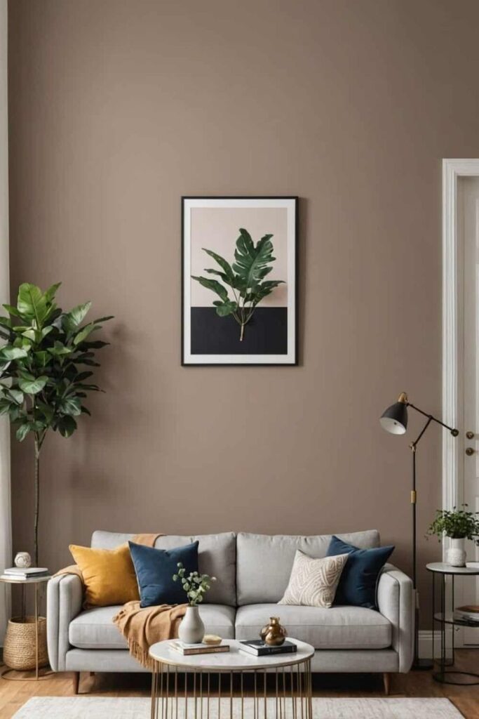
Mushroom taupe gives you depth like gray, but it leans warmer and richer. Think of it as gray’s more emotionally available cousin. I love it when I want a neutral that still feels design-y.
Taupe also hides scuffs better than bright whites. Do you have pets, kids, or a habit of bumping furniture like me?
- Best for: entryways, dining rooms, offices
- Pairs well with: cream trim, brass, walnut
- Pro tip: sample it next to your floors—undertones matter
4) Warm Sand (A Beachy Neutral Without the Seashell Theme)
Warm sand sits right in that sweet spot between beige and tan. It feels sunny and relaxed, and it makes a room look friendlier fast. I painted a small guest room this tone once, and it instantly stopped feeling like a storage closet with a bed.
If you want “light and airy” without going full white-on-white, warm sand nails it. Who says neutrals have to feel cold?
- Best for: guest rooms, kitchens, small spaces
- Pairs well with: white oak, rattan, soft black hardware
- Style tip: add crisp white trim for contrast
5) Blush Beige (Barely Pink, Very Grown-Up)
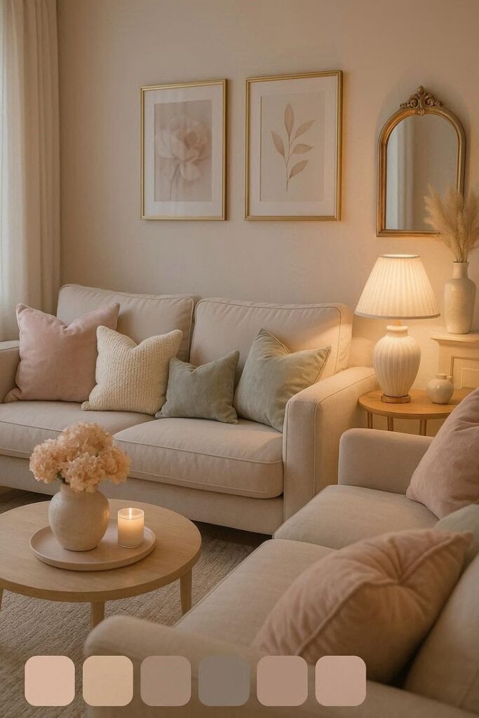
Blush beige adds warmth like a candle glow, but it never screams “nursery.” I love this one when I want a soft backdrop that still feels different from builder-grade neutrals. It also makes white trim look extra fresh.
And yes, your friends will say, “Wait… what color is this?” That’s the point.
- Best for: bedrooms, powder rooms, reading nooks
- Pairs well with: creamy whites, light woods, brushed brass
- Undertone watch: choose muted blush, not bubblegum
6) Muted Terracotta (Earthy, Cozy, and Shockingly Versatile)
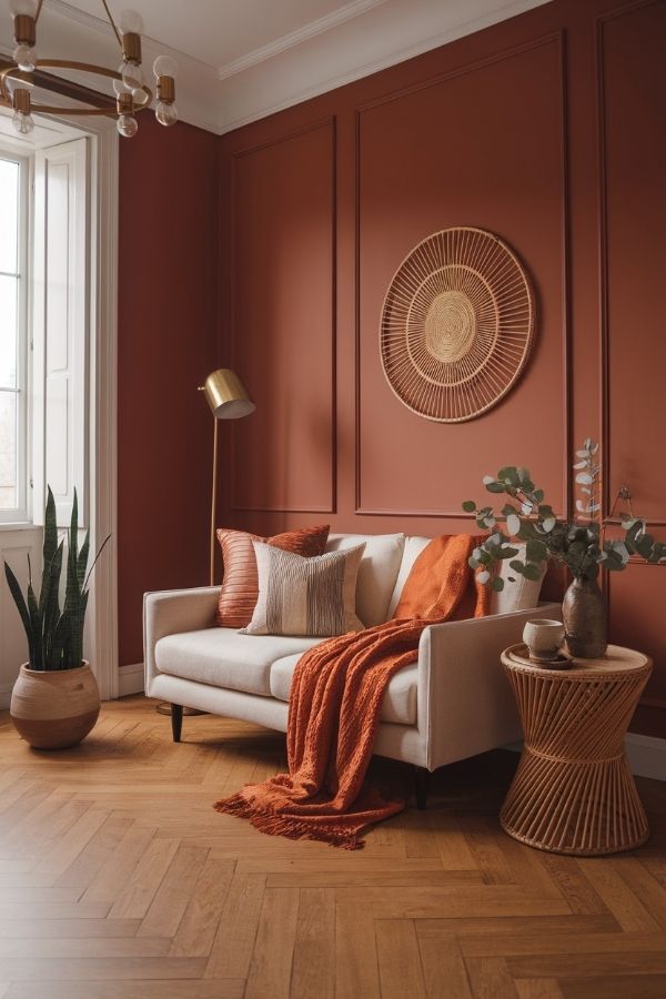
Muted terracotta brings warmth in a way gray never could. It feels grounded, earthy, and a little Mediterranean—without requiring you to start making sourdough. I like it most in rooms where people gather, because it makes everything feel welcoming.
Terracotta also looks amazing at night. Ever notice how some colors die under lamps? This one shows up.
- Best for: dining rooms, kitchens, accent walls
- Pairs well with: cream, olive, black, warm woods
- Finish tip: use matte to keep it modern
7) Clay Rose (Soft Color That Still Acts Like a Neutral)
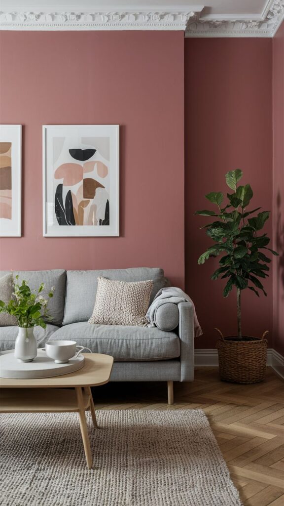
Clay rose sits between pink and brown, so it reads subtle and sophisticated. IMO, it works especially well if you want color but fear commitment. You get warmth, depth, and personality without overwhelming the room.
This shade also flatters a lot of textiles. Toss a chunky knit blanket in there and watch the room suddenly look “styled.”
- Best for: living rooms, bedrooms, nurseries (if you want chic)
- Pairs well with: camel leather, oak, off-white, dark green
- Quick test: view it in morning light and evening light
8) Sage Green (The Calm Everyone Wants Right Now)
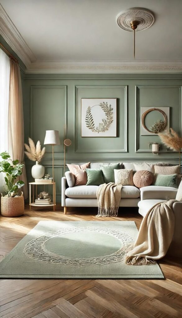
Sage green gives you that spa-like calm but still feels current. I love it as a whole-room color because it acts neutral while adding life. If gray made your room feel “fine,” sage makes it feel intentional.
Do you want a color that doesn’t argue with plants? Sage basically cheers them on.
- Best for: bedrooms, bathrooms, kitchens
- Pairs well with: white, light oak, aged brass
- Undertone tip: pick gray-green sage, not neon “herb garden”
9) Olive Green (Moody Without Going Full Cave)
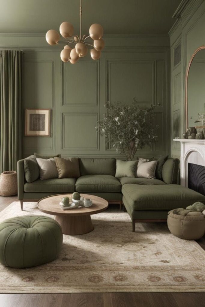
Olive green brings richness and sophistication, especially if you crave a darker alternative to gray. It reads classic and modern at the same time, which sounds fake but works in real life. I like olive when I want drama without the emo phase.
Olive also makes art and wood furniture pop. Ever wanted your room to look “collected” instead of “assembled”?
- Best for: offices, dining rooms, libraries, accent cabinetry
- Pairs well with: cream, cognac leather, matte black
- Pro move: add warm lighting to keep it cozy
10) Dusty Blue (Soft, Airy, and Way Less Cold Than Gray-Blue)
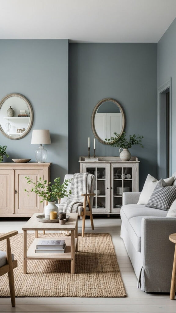
Dusty blue gives you color without turning your space into a cartoon sky. It feels calm, slightly vintage, and super livable. I used a dusty blue in a hallway once, and it made the whole place feel bigger and brighter.
If gray made your home feel chilly, dusty blue brings calm without the frostbite. Who needs icy undertones, honestly?
- Best for: bathrooms, bedrooms, laundry rooms
- Pairs well with: bright white, chrome, pale woods
- Avoid: overly saturated blues in low-light rooms
11) Deep Teal (Bold, Stylish, and Surprisingly Cozy)
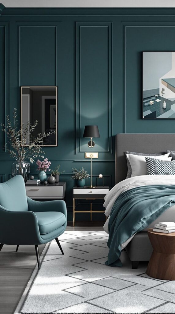
Deep teal brings instant personality and a little drama, in a good way. It sits between blue and green, so it feels rich and layered instead of loud. I love teal on built-ins or a dining room wall because it makes everything look more expensive than it was.
Do you want a color that makes even basic furniture feel intentional? Teal does that.
- Best for: dining rooms, offices, accent walls, powder rooms
- Pairs well with: brass, walnut, cream upholstery
- Finish tip: try satin on trim or cabinetry for depth
12) Navy (Classic, Clean, and Not Just for Coastal Themes)
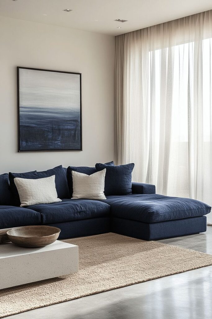
Navy gives you that deep, grounded neutral vibe without copying gray’s whole personality. It feels timeless, and it makes white trim look incredibly crisp. I’ve seen navy transform a basic bedroom into something that looks straight out of a boutique hotel.
And no, you don’t need anchor decor. Please don’t buy anchor decor.
- Best for: bedrooms, offices, statement walls
- Pairs well with: bright white, tan leather, warm metals
- Pro tip: use peel-and-stick samples because navy shifts a lot
13) Soft Black (Because Sometimes You Want Instant Wow)
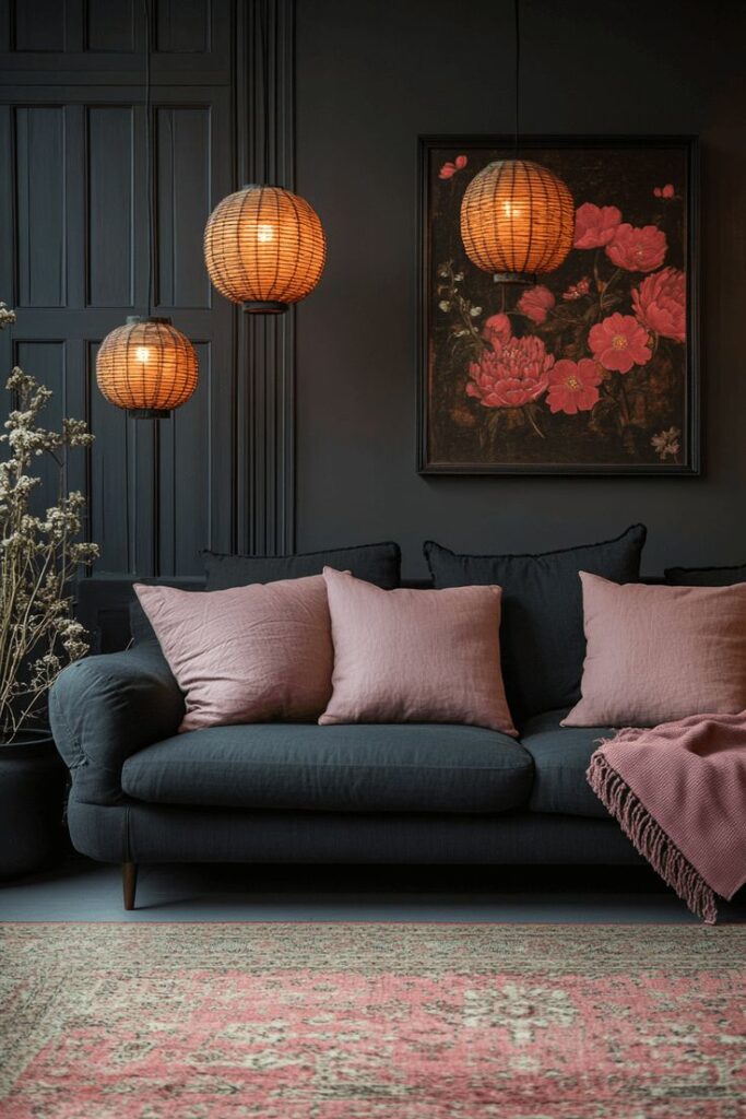
Soft black sounds scary until you see it done right. It gives you a dramatic, modern look while still acting like a neutral. I love soft black in small spaces like a powder room because it turns “tiny” into “high-end.”
Ever wanted a room to feel like a fancy little secret? Soft black nails that vibe.
- Best for: powder rooms, accent walls, fireplaces, doors
- Pairs well with: warm white, natural wood, stone textures
- Choose: a black with warm undertones to avoid a harsh look
Quick Tips to Pick the Right “No More Gray” Color Without Regret
You don’t need a design degree—you just need a plan. I’ve messed this up so you don’t have to.
- Test in your actual lighting. Morning sun and night lamps tell different stories.
- Match undertones to fixed stuff. Floors, counters, and tile won’t change for your new paint obsession.
- Pick a vibe per room. Do you want cozy, bright, moody, or energizing?
- Use sheen strategically. Matte hides wall flaws, and eggshell cleans easier in busy areas.
Conclusion: Gray Had Its Era—Now Your Walls Get a Personality
You can move on from gray without jumping into neon chaos. Try creamy off-whites, warm beiges, mushroom taupes, and earthy shades if you want safe-but-fresh. Grab sage, olive, dusty blue, teal, navy, or soft black if you want color that still feels grown-up.
So what’s your next move—do you sample three colors like a responsible adult, or do you paint first and “see what happens”? I won’t judge… but your trim might.